How to change the Font size and Font-color of barchart on Grafana 9.0.3.0
Hi I want to change the colour of ‘08/15 00’ , not the colour of bars. so could you please let me know how i can achieve this ?
Show me an example
hi , you can refer the same image where its having 08/15 00 text ,which you have shared …basically I want to change the colour of axis value .
if x axis contain Date then I want to change colour of 01/01/2020 , 02/01/2020 etc
Like this?

If so, set the color in “All” to “Series”:

And specify for each timeseries a color in the “Overrides” section:

I can’t picture exactly what you want, can you show us your panel? It’s not possible to change the color of Time axis.
Hi , I have marked with red lines for value which I want to modify for Color and Font-size or Font-family.
I want color as green, orange and grey for different axis values where as barchart color remains same as blue and sky blue.
Please refer the image .

You can’t set the color of the axis to a color different from its series. And it is not possible to change the color of the X axis time.
You can resort to Grafana plugins, something like Boom Theme plugin, where you can inject your own CSS file to modify the panels.
Hi , We have Boom Theme and able to change backgrond-color or panel title font using its CSS class name .
But we tried a lot to change the color/size of font in barchart value but ‘u-axis’ as a css class in barchart its not taking any modification,
Can you please tell me how i can use CSS in boom theme for achieving my requirement ?
Hello, has this problem finally been solved? I encountered the same problem as you. I also used Boom Theme plugin and couldn’t set the color of the axis text in the extended css of the boom theme.
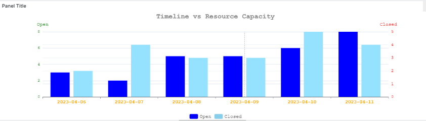
hello @shilpakarje i understand your requirement for my suggestion you can use Business Charts plugin , using this plugin you can easily achive you requirement.
for this follow the detailed steps
Step 1: Create table and insert data in it.

Step 2: select Business Charts plugin and fetch data using this postgresql query i used postgres you can use your database and fetch data on panel.

Step 3: write function to disply data
return {
  title: {
    text: 'Timeline vs Resource Capacity',
    left: 'center',
    textStyle: {
      color: 'grey',
      fontSize: 20,
      fontFamily: 'Courier New', // 👈 Font family for title
      fontWeight: 'bold'
    }
  },
  tooltip: {
    trigger: 'axis'
  },
  legend: {
    data: ['Open', 'Closed'],
    top: 'bottom',
    textStyle: {
      fontFamily: 'Courier New',
      fontSize: 14
    }
  },
  xAxis: {
    type: 'category',
    data: ['2023-04-06', '2023-04-07', '2023-04-08', '2023-04-09', '2023-04-10', '2023-04-11'],
    axisLabel: {
      color: 'orange',
      fontSize: 14,
      fontFamily: 'Courier New',
      fontWeight: 'bold',
      rotate: 0 // Optional: Rotate for readability
    }
  },
  yAxis: [
    {
      type: 'value',
      name: 'Open',
      nameTextStyle: {
        color: 'green',
        fontSize: 14,
        fontFamily: 'Courier New'
      },
      axisLabel: {
        color: 'green',
        fontSize: 12,
        fontFamily: 'Courier New'
      }
    },
    {
      type: 'value',
      name: 'Closed',
      nameTextStyle: {
        color: 'red',
        fontSize: 14,
        fontFamily: 'Courier New'
      },
      axisLabel: {
        color: 'red',
        fontSize: 12,
        fontFamily: 'Courier New'
      }
    }
  ],
  series: [
    {
      name: 'Open',
      type: 'bar',
      data: [3, 2, 5, 5, 6, 8],
      yAxisIndex: 0,
      itemStyle: {
        color: 'blue'
      }
    },
    {
      name: 'Closed',
      type: 'bar',
      data: [2, 4, 3, 3, 5, 4],
      yAxisIndex: 1,
      itemStyle: {
        color: 'skyblue'
      }
    }
  ]
}
Final output : change fount color and font family you can also customized your function according to your requirement.
