-
What Grafana version and what operating system are you using?
Grafana 8.3, Ubuntu -
What are you trying to achieve?
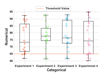
I am running performance tests on application elements and want to indicate the variability of all the tests within a run, and also how the performance varies over builds (not over time).
I also wanted to show the number of test results for each build, to give an indication on how reliable the results were.
-
How are you trying to achieve it?
I am trying to use a candlestick panel where each candlestick represents the variation of a single performance metrics within a build, and the builds are the X-axis.
I’ve defined 25% as Open, 75% as Close, and min and max as Low and High. This should give the central 50% range as the candle and the min-max line as the wick.
- What happened?
I can’t find a method of telling the panel that the X-axis is not a time series, but should be taken from another column in the query.
My data is not especially grouped by time although repeated test runs tend to be on the same day or consecutive days so I grouped by time(24h) and at least I get something that has a bar of differing length per day.
-
What did you expect to happen?
I expected the X-axis to either automatically be the first “group by” or at least I could change the panel config to select the column that should be the x-axis. -
Can you copy/paste the configuration(s) that you are having problems with?
SELECT percentile(“ok”, 25) AS “Open”, percentile(“ok”, 75) AS “Close”, min(“ok”) AS “Low”, count(“ok”) AS “Volume” FROM “autogen”.“gatling” WHERE (“build” =~ /^$BuildNumber$/ AND “profile” =~ /^$Profile$/) AND $timeFilter GROUP BY time(24h) -
Did you receive any errors in the Grafana UI or in related logs? If so, please tell us exactly what they were.
No -
Did you follow any online instructions? If so, what is the URL?
The only documentation I could find: Candlestick | Grafana documentation