Y axis values changes when I zoom out the time range - can anyone explain why?
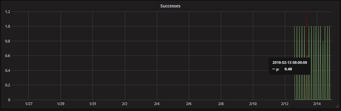
Shows each data point is at 0.5
When zooming in, each data point is at 1.0

Thanks, Tal
Sounds like something is wrong with your query. What data source are you using?
I am using MT.
It also happened when I used graphite.
It is consistent. I think I can reproduce it on play.grafana.com.
Usually this sort of problem is something to do with your Graphite storage retentions and not using the summarize function. But that is only 2 days you zoomed out to. Could you show a screenshot of the query on play.grafana.org (and a link to the dashboard) when you recreated the issue?
It appears that you have a series that is being stored every minute, and every now and then the value stored is incremented by one.
On the “zoomed in” graph, you have a period of roughly 5 hours or 300 minutes, so graphite returns 300 points at one-minute intervals and you get the graph you expect.
When you zoom out, you’re now looking at a period of roughly 24 hours or 1200 minutes. Grafana can’t show more points than you have pixels on the graph (in this case roughly 1000) so with every request to graphite (or MT) it sends maxDataPoints=<graph width in px>. Because the one-minute resolution data would result in more than maxDataPoints being returned, Graphite downsamples the data by taking each pair of points and returning the average of that pair so it returns 600 points. That averaging is why you see values of 0.5, because they are the average of a point with a value of 1 and the adjacent point with a value of 0.
When you request an even longer time range like the ~52hrs in your CSV export, the same thing happens. In this case the raw data would have 52 * 60 = 3120 points, so Graphite has to combine each 4 adjacent points to not exceed maxDataPoints. This results in each returned point being spaced 4 minutes apart, and your spikes now having a value of average(1, 0, 0, 0) = 0.25.
The good news is the Graphite provides the consolidateBy function to tell it which function to use for that consolidation (which defaults to average as seen above). You can use consolidateBy('sum') to get correct results for your use-case, since it will sum the values that go into each interval rather than averaging them.
Thank you for the very detailed explanation.
I figured that it is related to density and pixels.
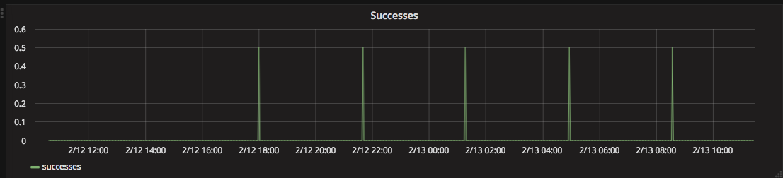
I tried to use consolidateBy('sum') and it improved the situation a lot, however, when I zoom out a bit more, it again behaves differently.
See the example now:
For some reason, in some of the cases, depends on the time of the data point, it decided to put more than 1 data point. In this example, 0.6 + 0.4 = 1.0.
Is there anything additional I can to do be even more consistent in such small numbers when I zoom out?
Now you’re zoomed out enough that you’re likely running into the aggregations defined in your schema, since your 1-minute retention period is likely to be shorter than the ~3 weeks you’re querying.
To get accurate results with counter values in Graphite you would set up your storage-aggregations.conf to roll the counters up by the last value in the interval, which would give you accurate data for nonNegativeDerivative to work from.
MT always computes min, max, sum & count rollups, but at run-time it will use sum & count to return the average unless it’s told otherwise.
Right now there isn’t a good way to solve the problem when querying MT via graphite-web, since graphite-web doesn’t pass consolidateBy through to MT and that is what MT uses to determine which rollup to use.
Hi, I have the similar problem, and I must say that I don’t care why it happens - if a value is 400 it should be 400 on every “zoom level”.
I send data from Zabbix, and I have values ranging between 200 and 500 but they get screwed somehow and where there should be 500 I get 320 or something. And this is not documented, it’s a behavior that no one is expecting, a thing that shoudn’t happen.
So please make it work, cause such behavior is putting Grafana under Shit software category.
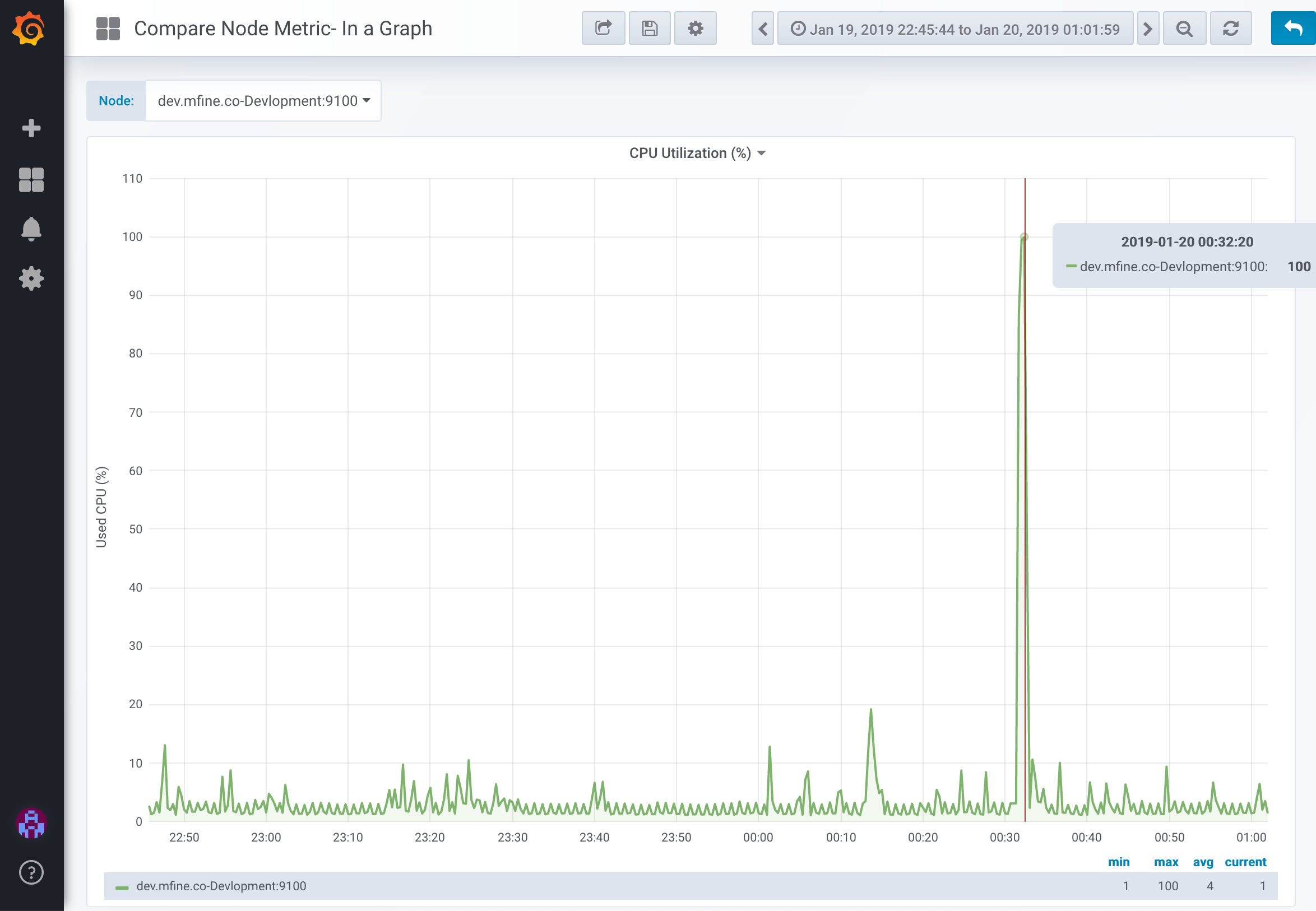
facing the same issue, i am using the Prometheus as data source to get the CPU Utilization percentage.
Query:
100 - (avg by (instance) (irate(node_cpu_seconds_total{job=~“$job”,instance=~“$node”,mode=“idle”}[5m])) * 100)
Query is explained here:Understanding Machine CPU usage – Robust Perception | Prometheus Monitoring Experts
when i am changing time range from 24 hours to 5 min, value in Y axis is changing.
I have the same issue, is there already a solution for this issue with grafana - prometheus queries ?
I have a dasboard created for jmeter performance tests and it is useless as i can not compare performance over time. Since values only correct if zooming in but i want to compare differences (in bar graph) between performance over time (Trends >1 month).
Thanks
If there is any solution where I can use “average” instead of “sum” when the time range is scaled, it would be very useful for me as well.
Can anybody share if they any such feature?
Same here - with Zabbix datasource. The larger the time window the less data points which results in the calculations (min, max etc) being incorrect. They work perfectly in Zabbix itself. Is there a solution for this?
I am also facing the same issue, i am using the Prometheus as data source to metrics details.
Every day we are getting value and the range is 2 to 10.
Example:
On 04/27/2022- received 4 tickets
On 04/28/2022- received 3 tickets
On 04/29/2022- received 2 tickets
Every day If I watch the graph with last 24 hours data, it is showing correctly and Y axis value is increasing as 0.2,0.4,0.6,0.8…etc
If I choose last 2 days or last 7 days then Y axis value is increased as 0,5,10,15,20,25,30…etc. Due to this I am not able to view the data properly
Any idea about this