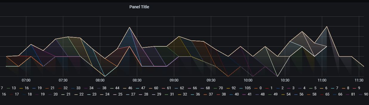
I’m getting a graph which looks like this:

How to get a continuous fill under the graph and why do I have a different color for each value?
How can I set my data to a single color?
Best regards,
Aga
I’m getting a graph which looks like this:
How to get a continuous fill under the graph and why do I have a different color for each value?
How can I set my data to a single color?
Best regards,
Aga
… and after adding another query, I’m getting also not very readable result:
Does anyone has an idea what could be the cause?
For the record, the time column is a bit cheated - I do not have absolute time values in my database, only relative time - basic_tick, so in order to see my data in timely manner, I use query like this:
(now() - interval '5 hours' + (ROW_NUMBER() OVER(ORDER BY basic_tick)) * interval '10 minutes') as time
The anwer is: time should be in quotation marks.
(now() - interval '5 hours' + (ROW_NUMBER() OVER(ORDER BY basic_tick)) * interval '10 minutes') as "time"