Nice idea but let’s hope there will be a regular option.
I’ve been using the new style a lot for the past two weeks and neither I nor any of my colleagues and friends like it.
At one of my friends companies they even downgraded grafana (used on a 85" screen as dashboard in the factory) as the new design got some negative feedback from the users.
1 Like
After reading through this thread I thought it would be worth it creating an issue in the grafana repository, in which I listed a few possible configuration scenarios.
I would be happy to open a PR to let people choose how they want their titles to be aligned. Feel free to add ideas in the ticket if the per panel configuration isn’t what you think would work best.
please make this an option.
Appreciate it. Thanks for opening an issue in the Grafana repository.
Still no updates on this…
Because of my impatience, I have downgraded to v9.4.14 which looks great for my graphs on tablets, phones and computers. Switching between dashboards on the phone now also works perfect without resizing every time.
To downgrade, I simply downloaded Grafana v9.4.14 which was the last normal version:
wget https://dl.grafana.com/oss/release/grafana_9.4.14_amd64.deb
And then I just downgraded with:
dpkg -i grafana_9.4.14_amd64.deb
Then, to be on the safe side, I disabled Grafana automatic upgrade back to broken version:
apt-mark hold grafana
F.
Any update on this?
Having the panel title on the right is almost awful in some situation
Hilarious that centering a title “feature” would be removed in the first place and that our user stories would just be dismissed. This sort of intervention really leaves a bad taste in my mouth.
Hi @Grafana team, we are just preparing to jump to the next 9.x version (the 10th does not fit our custom dashboards built on the old Table plugin) and found this UI change. It makes panel titles less distinguishable, especially in dashboard lists and where row titles are used. So I would join other votes for returning to the centered titles or allowing to configure alignment generally for Grafana instance.
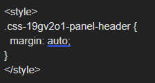
You can try a css workaround, it will require you to edit your grafana.ini
[panels]
disable_sanitize_html = true
then add a text panel, switch it to html and add the following:
Text to copy instead of typing it out:
.css-19gv2o1-panel-header {
margin: auto;
}

1 Like
@sowdenraymond , thank you for a hint.
Not sure that I understand completely how it is applied. After a change in grafana.ini, where should I use the CSS code block?
Dashboard with left aligned titles:

right click and inspect the title:

scroll through the elements on the right hand side until it highlights the title:

see there is no margin auto in the styling:

directly typing in the style centers the one title:

but you want this for all titles, so add a text panel like below:

and now all the panels have centered titles:

please note this is a workaround, and the css class names could change at anytime
2 Likes
@sowdenraymond , thank you for the detailed explanations. I discussed this method with the team, and it seems it would be better just to keep it “as is” rather than fixing almost one thousand dashboards that we have.
1 Like
Another vote for allowing center alignment. Grafana is a great tool, I’ve used it several times to create dashboards and insight for industrial plants operation data. I agree some other dashboards products have left alignment, but I don’t think it is a good practice and I will try to contribute and put some reasoning as an end-user.
The main point is that if the text is aligned with the picture bellow it, the user can see two information at once, without moving the eye. So it is more ergonomic and productive. That is the reason the number of a gauge is together with the gauge picture, or the reason we use a radar panel to condense several important KPIs in a single condensed object instead of several individual distributed singlestats.
So in a Singlestat or Gauge we generally describe the value with a text and it would be very productive to see both at once, in the same alignment. It is still possible to achieve the alignment if we use the series name. In singlestat the name is aligned with the value and it is even not possible to change this alignment. In gouges the name is centered bellow. So why would the title be the opposite? As we can see in several user’s examples, a lot of people use the panel title to describe the value, instead of the series name inside the panel. There is also a reason for it: using title to describe helps keeping text positioning consistency among panels, since Singlestat name is above the number, while in the gauge it is bellow it.
In time series graphs, center alignment of the title also helps quickly identifying graph objective, since our tendency is to look at the center of the panel. Left aligned title also may generate confusion with y-axis labeling.
In a data table, generally all columns are centered, so that the overall view has a sense of spacing between the vertical themes and make it easier for the brain to group the info. This is the same perception we have in the overall view of a dashboard page. If it is well designed, objects are aligned and grouped together in columns and rows. That is why distributing in a grid is also an important feature. When title is left aligned it looks like it is not part of the group of the values.
I would allow both center and left alignment, because the latter might also be useful in some cases:
- Text is very long. It is better to read long texts such as sentences when left aligned. So if for some reason a long description is necessary, left-align is better.
- Alphabetical order of elements. If you have several Singlestats, Gauges, or a table, and the name of each panel or row bellow the other is in alphabetical order to allow quickly locating the one you need. Then left-alignment brings attention to this ordering and makes it easier for a quick visual search.
- Title is a not so important tip that might be not necessary to read for the experienced user. The panel bellow is already quite self-describing. Then I would even change font color to something with less contrast with background. Texts with two levels of contrast would be another nice feature.
As a side note, coming from industry automation background, I would also like to see theme, hierarchy and more objects complying with ISA-101 HMI Standard. For an overall managing overview, it may not be a big point, but if the objective is a monitoring tool for quickly diagnosing critical issues, why reinvent the wheel if there are already some great well thought standards used by petrochemicals for critical process monitoring?
1 Like
The blog is now live about this topic:
It explains the history, redesign, technical challenges, and further discussion (Your Feedback).
1 Like
Will .css-19gv2o1-panel-header stay the same, or could it change with a new version ?
Quote from above:
“please note this is a workaround, and the css class names could change at anytime”
if they do change, you can just follow the same procedure to get the new name.
is there any update for this feature? really want the title panel to be centered without editing css styles ![]()
I know this discussion has been going for some time, but I just want to add my 2¢ request to at least allow people to get back to previous default behaviour.
I personally have a pretty strong dislike for systems which change the default behaviour of something like this, and a very strong dislike for ones which don’t allow the user then to put things back the way they were.
Grafana 9.4.x: Titles are centred, everyone seems happy (at least, I don’t remember requests for changing it).
Grafana 9.5.x: Titles are suddenly left-aligned with no way to get them back to the centre (without a pretty complex workaround, which I know has been documented, but is frankly a ridiculous long-term solution).
I get that designers decided “hey, things might look better on the left!”, but clearly not everyone agrees with this, and to take away the option of seeing things the way they were before is just a bad attitude towards users.
It tells people “we think we know better than you do how your dashboards should look, so we’re changing them”.
Best solution: keep the default to be centred, provide an option for left-aligned, document that it’s available
Second-best solution: make the default left-aligned, provide an option to set things back to centred, document the change and the option
Worst solution: force everyone’s dashboards to look different and turn a deaf ear to everyone who says “we want it back the way it was”.
Come on, developers - it can’t be that hard!?
Antony.
2 Likes
Second-best solution +1 , keep the default left-align BUT add an option to change centered
I created an account just to say that I really want to see an option to have the title centered.
Having it to the left does not make any sense from a readability point of view. There is often a lot of text happening around the title now, legends from a graph above, y-axis title, y-axis values etc. Previously it was very to easy to see exactly what the title for the graph was and what it contained. Now on a page with multiple graphs and on a wide display I have to actively search for the title. Whereas previously it was normally right where I was looking and very prominent as it was the only text element in that particular area of the screen.
Please give users an option to center the tile. I don’t understand why it is so hard to
- Understand that this is worse visually, i.e. it is harder at a glance to understand what I am looking at
- Give users options to format their graphs as they see fit. choosing left / center / right title placement should be an obvious choice, given that there are a tons of choices for every other thing in Grafana.
Please don’t get stuck in “This is better” and we will not listen to our users.
3 Likes