
Introduction:
Pie charts are a popular and effective way to visualize data, offering a clear and concise representation of the proportional distribution of categories within a dataset. The Business Charts Plugin provides a robust and user-friendly toolset for creating visually appealing and informative pie charts, making it easier for businesses to interpret and communicate their data insights.
You can follow these steps to customize all labels as you want
Step 1. Create table with your desired fields and insert your desired data:

Step 2. Install the business charts plugin

Step 3. Create new grafana dashboard and add visualization

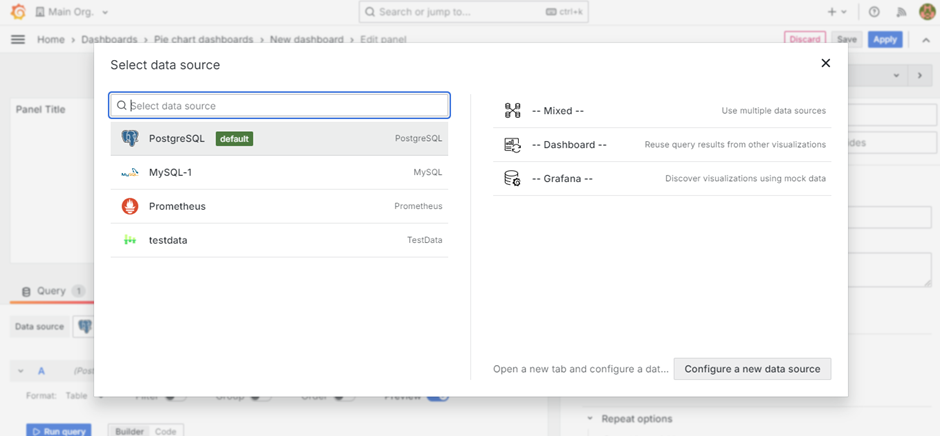
Step 4. Click on add visualization and select your desired datasource
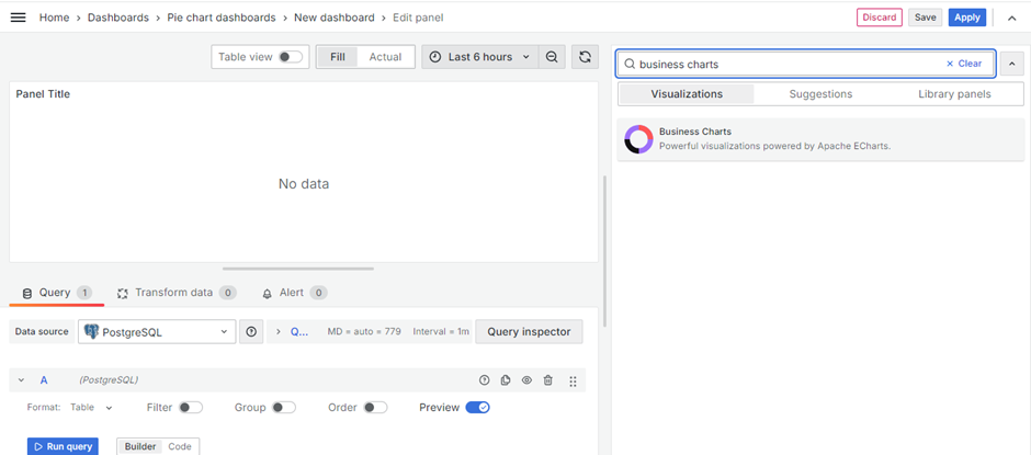
Step 5. Search for business charts panel type and click on it
Step 6. Write select query for selecting your desired data

Step 7. Now go to the function section and paste this JSON code to this section
return {
dataset: {
source: context.editor.dataset.source,
},
series: [
{
name: ‘’,
type: ‘pie’,
bottom: ‘50’,
radius: ‘70%’,
emphasis: {
itemStyle: {
shadowBlur: 10,
shadowOffsetX: 0,
shadowColor: ‘rgba(0, 0, 0, 0.5)’
},
label: {
formatter: function (params) {
var label = ;
const FIRST_ROW_INDEX = 0; // Define a constant for the first row index
        // Add dynamic fields from the dataset
        var additionalFields = context.editor.dataset.source[FIRST_ROW_INDEX]; // Get column names from the first row
        var firstlable = additionalFields[0]
        // Add the first value
        label.push('{a|' + firstlable.substring(2) + '}' + '  : ' + params.value[0].slice(0, -8));

        // Add subsequent values
        for (var i = 1; i < params.value.length; i++) {
          var fieldName = additionalFields[i];
          label.push('{a|' + fieldName.substring(2) + '}' + '  : ' + (params.value[i] || '-'));
        }

        return label.join('\n');

      },
      backgroundColor: '#fff',
      borderColor: '#8C8D8E',
      borderWidth: 1,
      borderRadius: 4,
      rich: {
        a: {
          color: '#000',
          lineHeight: 22,
          align: 'left',
          fontWeight: 'bold'
        },
        hr: {
          borderColor: '#000',
          width: '100%',
          borderWidth: 1,
          height: '100px'
        },
        b: {
          color: '#000',
          width: '100%',
          padding: [6, 4]  // Example padding
        },
        per: {
          color: '#000',
          padding: [5, 3],
          fontWeight: 'bold'  // Example padding
        },
        c: {
          color: '#000',
          padding: [5, 3],
        }
      }
    }
  },
  tooltip: {
    trigger: 'item',
    formatter: '{a} <br/>{b}: {c} ({d}%)' // Tooltip format including percentage
  },
  legend: {
    orient: 'vertical',
    left: 'right',
    top: 'center',
    align: 'left',
    textStyle: {
      color: '#000'
    },
    formatter: function (params) {
      var padding = '   '; // Adjust the padding as needed
      var data = series[0].data;
      for (var i = 0; i < data.length; i++) {
        if (data[i].params === params) {
          return padding + params + ' (' + data[1].percent.toFixed(2) + '%)';
        }
      }
      return padding + params;
    }
  }
}
]
};

Step 8. Now go to the Visual editor section and add your fields but make sure following points while adding these fields:
- The first field will be the label value field
- The second field will be the pie chart slice value
- The values after second field will started listing below the tooltip values

Step 9. Click on save and then apply
Final Outcome:

lochanie1987
If you need any assistance, please feel free to contact me.
Shanker Agarwal
(Grafana Architect)
shanker.agarwal@dataabsolute.com