this PR does three things:
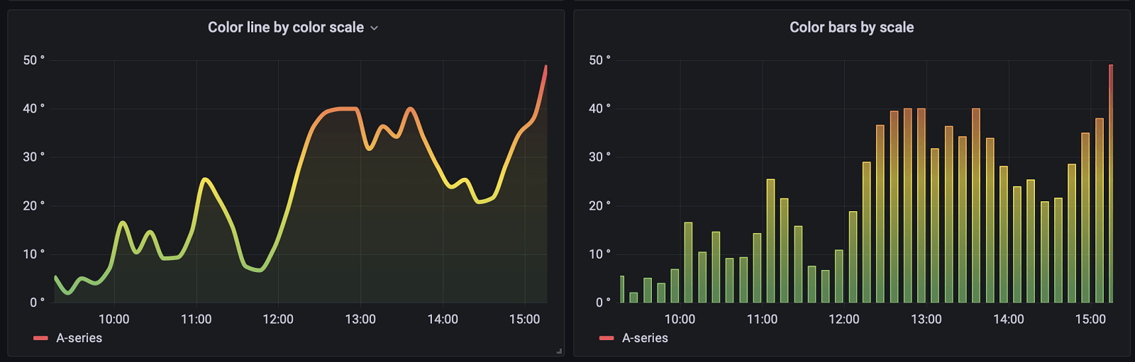
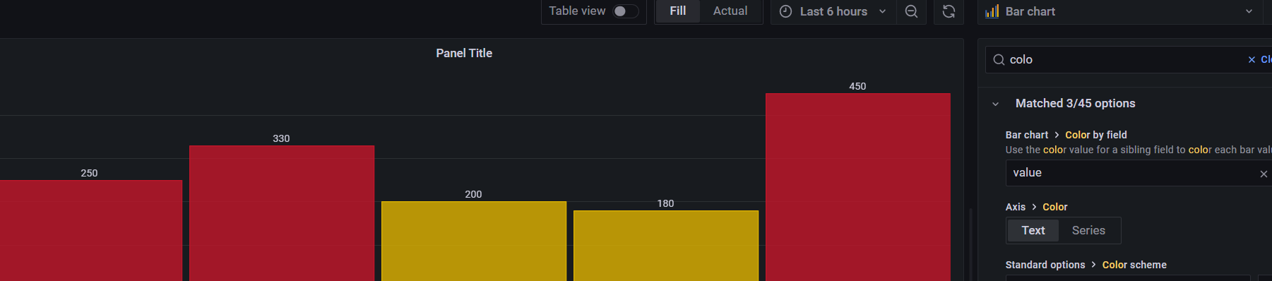
1. makes thresholds in BarChart color the entire b…ar rather than behaving more like TimeSeries where the thresholds _can_ be rendered _through_ the bars, making it look stacked when it isnt. this is already how it worked when you had `colorByField` defined with that field's thresholds overridden. this makes the behavior uniform and less confusing.
2. adds the TimeSeries' dedicated thresholds renderer to BarChart, so you can render them as lines or regions.
3. makes shared value mappings for color work without having to specify a `colorByField` option.
<details><summary>barchart-colors.json</summary>
```json
{
"annotations": {
"list": [
{
"builtIn": 1,
"datasource": {
"type": "datasource",
"uid": "grafana"
},
"enable": true,
"hide": true,
"iconColor": "rgba(0, 211, 255, 1)",
"name": "Annotations & Alerts",
"target": {
"limit": 100,
"matchAny": false,
"tags": [],
"type": "dashboard"
},
"type": "dashboard"
}
]
},
"editable": true,
"fiscalYearStartMonth": 0,
"graphTooltip": 0,
"id": 114,
"links": [],
"liveNow": false,
"panels": [
{
"datasource": {
"type": "testdata",
"uid": "PD8C576611E62080A"
},
"fieldConfig": {
"defaults": {
"color": {
"mode": "thresholds"
},
"custom": {
"axisCenteredZero": false,
"axisColorMode": "text",
"axisLabel": "",
"axisPlacement": "auto",
"axisSoftMin": 0,
"fillOpacity": 50,
"gradientMode": "scheme",
"hideFrom": {
"legend": false,
"tooltip": false,
"viz": false
},
"lineWidth": 1,
"scaleDistribution": {
"type": "linear"
},
"thresholdsStyle": {
"mode": "dashed"
}
},
"mappings": [],
"thresholds": {
"mode": "absolute",
"steps": [
{
"color": "green",
"value": null
},
{
"color": "#EAB839",
"value": 10
},
{
"color": "#E24D42",
"value": 15
},
{
"color": "#6ED0E0",
"value": 25
}
]
}
},
"overrides": []
},
"gridPos": {
"h": 9,
"w": 8,
"x": 0,
"y": 0
},
"id": 4,
"options": {
"barRadius": 0,
"barWidth": 0.97,
"groupWidth": 0.7,
"legend": {
"calcs": [],
"displayMode": "list",
"placement": "bottom",
"showLegend": true
},
"orientation": "auto",
"showValue": "auto",
"stacking": "none",
"tooltip": {
"mode": "single",
"sort": "none"
},
"xTickLabelRotation": 0,
"xTickLabelSpacing": 0
},
"targets": [
{
"csvContent": "label,value\nx,3\na,10\nb,20\nc,30",
"datasource": {
"type": "testdata",
"uid": "PD8C576611E62080A"
},
"refId": "A",
"scenarioId": "csv_content"
}
],
"title": "default thresholds",
"type": "barchart"
},
{
"datasource": {
"type": "testdata",
"uid": "PD8C576611E62080A"
},
"fieldConfig": {
"defaults": {
"color": {
"mode": "thresholds"
},
"custom": {
"axisCenteredZero": false,
"axisColorMode": "text",
"axisLabel": "",
"axisPlacement": "auto",
"axisSoftMin": 0,
"fillOpacity": 50,
"gradientMode": "none",
"hideFrom": {
"legend": false,
"tooltip": false,
"viz": false
},
"lineWidth": 1,
"scaleDistribution": {
"type": "linear"
},
"thresholdsStyle": {
"mode": "off"
}
},
"mappings": [
{
"options": {
"from": 0,
"result": {
"color": "green",
"index": 0
},
"to": 9.9999
},
"type": "range"
},
{
"options": {
"from": 10,
"result": {
"color": "yellow",
"index": 1
},
"to": 14.9999
},
"type": "range"
},
{
"options": {
"from": 15,
"result": {
"color": "red",
"index": 2
},
"to": 24.9999
},
"type": "range"
},
{
"options": {
"from": 25,
"result": {
"color": "blue",
"index": 3
},
"to": 100000
},
"type": "range"
}
],
"thresholds": {
"mode": "absolute",
"steps": [
{
"color": "green",
"value": null
}
]
}
},
"overrides": []
},
"gridPos": {
"h": 9,
"w": 8,
"x": 8,
"y": 0
},
"id": 5,
"options": {
"barRadius": 0,
"barWidth": 0.97,
"groupWidth": 0.7,
"legend": {
"calcs": [],
"displayMode": "list",
"placement": "bottom",
"showLegend": true
},
"orientation": "auto",
"showValue": "auto",
"stacking": "none",
"tooltip": {
"mode": "single",
"sort": "none"
},
"xTickLabelRotation": 0,
"xTickLabelSpacing": 0
},
"targets": [
{
"csvContent": "label,value\nx,3\na,10\nb,20\nc,30",
"datasource": {
"type": "testdata",
"uid": "PD8C576611E62080A"
},
"refId": "A",
"scenarioId": "csv_content"
}
],
"title": "default value mappings",
"type": "barchart"
},
{
"datasource": {
"type": "testdata",
"uid": "PD8C576611E62080A"
},
"fieldConfig": {
"defaults": {
"color": {
"mode": "thresholds"
},
"custom": {
"axisCenteredZero": false,
"axisColorMode": "text",
"axisLabel": "",
"axisPlacement": "auto",
"axisSoftMin": 0,
"fillOpacity": 50,
"gradientMode": "none",
"hideFrom": {
"legend": false,
"tooltip": false,
"viz": false
},
"lineWidth": 1,
"scaleDistribution": {
"type": "linear"
},
"thresholdsStyle": {
"mode": "off"
}
},
"mappings": [],
"thresholds": {
"mode": "absolute",
"steps": [
{
"color": "green",
"value": null
}
]
}
},
"overrides": []
},
"gridPos": {
"h": 9,
"w": 8,
"x": 16,
"y": 0
},
"id": 3,
"options": {
"barRadius": 0,
"barWidth": 0.97,
"colorByField": "value",
"groupWidth": 0.7,
"legend": {
"calcs": [],
"displayMode": "list",
"placement": "bottom",
"showLegend": true
},
"orientation": "auto",
"showValue": "auto",
"stacking": "none",
"tooltip": {
"mode": "single",
"sort": "none"
},
"xTickLabelRotation": 0,
"xTickLabelSpacing": 0
},
"targets": [
{
"datasource": {
"type": "testdata",
"uid": "PD8C576611E62080A"
},
"rawFrameContent": "[\n {\n \"schema\": {\n \"refId\": \"A\",\n \"fields\": [\n {\n \"name\": \"label\",\n \"type\": \"string\",\n \"typeInfo\": {\n \"frame\": \"string\",\n \"nullable\": true\n },\n \"config\": {}\n },\n {\n \"name\": \"value\",\n \"type\": \"number\",\n \"typeInfo\": {\n \"frame\": \"int64\",\n \"nullable\": true\n },\n \"config\": {\n \"thresholds\": {\n \"mode\": \"absolute\",\n \"steps\": [\n {\n \"color\": \"green\",\n \"value\": null\n },\n {\n \"color\": \"#EAB839\",\n \"value\": 10\n },\n {\n \"color\": \"red\",\n \"value\": 15\n },\n {\n \"color\": \"#6ED0E0\",\n \"value\": 25\n }\n ]\n }\n }\n }\n ]\n },\n \"data\": {\n \"values\": [\n [\n \"x\",\n \"a\",\n \"b\",\n \"c\"\n ],\n [\n 3,\n 10,\n 20,\n 30\n ]\n ]\n }\n }\n]",
"refId": "A",
"scenarioId": "raw_frame"
}
],
"title": "colorByField (field thresholds from data)",
"type": "barchart"
},
{
"datasource": {
"type": "testdata",
"uid": "PD8C576611E62080A"
},
"fieldConfig": {
"defaults": {
"color": {
"mode": "thresholds"
},
"custom": {
"axisCenteredZero": false,
"axisColorMode": "text",
"axisLabel": "",
"axisPlacement": "auto",
"axisSoftMin": 0,
"fillOpacity": 50,
"gradientMode": "scheme",
"hideFrom": {
"legend": false,
"tooltip": false,
"viz": false
},
"lineWidth": 1,
"scaleDistribution": {
"type": "linear"
},
"thresholdsStyle": {
"mode": "off"
}
},
"mappings": [],
"thresholds": {
"mode": "absolute",
"steps": [
{
"color": "green",
"value": null
},
{
"color": "red",
"value": 80
}
]
}
},
"overrides": [
{
"matcher": {
"id": "byName",
"options": "value"
},
"properties": [
{
"id": "thresholds",
"value": {
"mode": "absolute",
"steps": [
{
"color": "green",
"value": null
},
{
"color": "#EAB839",
"value": 10
},
{
"color": "#E24D42",
"value": 15
},
{
"color": "#6ED0E0",
"value": 25
}
]
}
}
]
}
]
},
"gridPos": {
"h": 9,
"w": 8,
"x": 0,
"y": 9
},
"id": 8,
"options": {
"barRadius": 0,
"barWidth": 0.97,
"groupWidth": 0.7,
"legend": {
"calcs": [],
"displayMode": "list",
"placement": "bottom",
"showLegend": true
},
"orientation": "auto",
"showValue": "auto",
"stacking": "none",
"tooltip": {
"mode": "single",
"sort": "none"
},
"xTickLabelRotation": 0,
"xTickLabelSpacing": 0
},
"targets": [
{
"csvContent": "label,value\nx,3\na,10\nb,20\nc,30",
"datasource": {
"type": "testdata",
"uid": "PD8C576611E62080A"
},
"refId": "A",
"scenarioId": "csv_content"
}
],
"title": "override thresholds",
"type": "barchart"
},
{
"datasource": {
"type": "testdata",
"uid": "PD8C576611E62080A"
},
"fieldConfig": {
"defaults": {
"color": {
"mode": "thresholds"
},
"custom": {
"axisCenteredZero": false,
"axisColorMode": "text",
"axisLabel": "",
"axisPlacement": "auto",
"axisSoftMin": 0,
"fillOpacity": 80,
"gradientMode": "none",
"hideFrom": {
"legend": false,
"tooltip": false,
"viz": false
},
"lineWidth": 1,
"scaleDistribution": {
"type": "linear"
},
"thresholdsStyle": {
"mode": "off"
}
},
"mappings": [],
"thresholds": {
"mode": "absolute",
"steps": [
{
"color": "green",
"value": null
}
]
}
},
"overrides": [
{
"matcher": {
"id": "byName",
"options": "value"
},
"properties": [
{
"id": "mappings",
"value": [
{
"options": {
"from": 0,
"result": {
"color": "green",
"index": 0
},
"to": 9.9999
},
"type": "range"
},
{
"options": {
"from": 10,
"result": {
"color": "yellow",
"index": 1
},
"to": 14.9999
},
"type": "range"
},
{
"options": {
"from": 15,
"result": {
"color": "red",
"index": 2
},
"to": 24.9999
},
"type": "range"
},
{
"options": {
"from": 25,
"result": {
"color": "blue",
"index": 3
},
"to": 100000
},
"type": "range"
}
]
}
]
}
]
},
"gridPos": {
"h": 9,
"w": 8,
"x": 8,
"y": 9
},
"id": 7,
"options": {
"barRadius": 0,
"barWidth": 0.97,
"groupWidth": 0.7,
"legend": {
"calcs": [],
"displayMode": "list",
"placement": "bottom",
"showLegend": true
},
"orientation": "auto",
"showValue": "auto",
"stacking": "none",
"tooltip": {
"mode": "single",
"sort": "none"
},
"xTickLabelRotation": 0,
"xTickLabelSpacing": 0
},
"targets": [
{
"csvContent": "label,value\nx,3\na,10\nb,20\nc,30",
"datasource": {
"type": "testdata",
"uid": "PD8C576611E62080A"
},
"refId": "A",
"scenarioId": "csv_content"
}
],
"title": "override value mappings",
"type": "barchart"
},
{
"datasource": {
"type": "testdata",
"uid": "PD8C576611E62080A"
},
"fieldConfig": {
"defaults": {
"color": {
"mode": "thresholds"
},
"custom": {
"axisCenteredZero": false,
"axisColorMode": "text",
"axisLabel": "",
"axisPlacement": "auto",
"axisSoftMin": 0,
"fillOpacity": 80,
"gradientMode": "none",
"hideFrom": {
"legend": false,
"tooltip": false,
"viz": false
},
"lineWidth": 1,
"scaleDistribution": {
"type": "linear"
},
"thresholdsStyle": {
"mode": "off"
}
},
"mappings": [],
"thresholds": {
"mode": "absolute",
"steps": [
{
"color": "green",
"value": null
}
]
}
},
"overrides": [
{
"matcher": {
"id": "byName",
"options": "value"
},
"properties": [
{
"id": "mappings",
"value": [
{
"options": {
"from": 0,
"result": {
"color": "green",
"index": 0
},
"to": 9.9999
},
"type": "range"
},
{
"options": {
"from": 10,
"result": {
"color": "yellow",
"index": 1
},
"to": 14.9999
},
"type": "range"
},
{
"options": {
"from": 15,
"result": {
"color": "red",
"index": 2
},
"to": 24.9999
},
"type": "range"
},
{
"options": {
"from": 25,
"result": {
"color": "#6ed0e0",
"index": 3
},
"to": 100000
},
"type": "range"
}
]
}
]
}
]
},
"gridPos": {
"h": 9,
"w": 8,
"x": 16,
"y": 9
},
"id": 6,
"options": {
"barRadius": 0,
"barWidth": 0.97,
"colorByField": "value",
"groupWidth": 0.7,
"legend": {
"calcs": [],
"displayMode": "list",
"placement": "bottom",
"showLegend": true
},
"orientation": "auto",
"showValue": "auto",
"stacking": "none",
"tooltip": {
"mode": "single",
"sort": "none"
},
"xTickLabelRotation": 0,
"xTickLabelSpacing": 0
},
"targets": [
{
"csvContent": "label,value\nx,3\na,10\nb,20\nc,30",
"datasource": {
"type": "testdata",
"uid": "PD8C576611E62080A"
},
"refId": "A",
"scenarioId": "csv_content"
}
],
"title": "colorByField (value mappings field override)",
"type": "barchart"
},
{
"datasource": {
"type": "testdata",
"uid": "PD8C576611E62080A"
},
"fieldConfig": {
"defaults": {
"color": {
"mode": "palette-classic"
},
"custom": {
"axisCenteredZero": false,
"axisColorMode": "text",
"axisLabel": "",
"axisPlacement": "auto",
"fillOpacity": 50,
"gradientMode": "none",
"hideFrom": {
"legend": false,
"tooltip": false,
"viz": false
},
"lineWidth": 1,
"scaleDistribution": {
"type": "linear"
},
"thresholdsStyle": {
"mode": "off"
}
},
"mappings": [],
"thresholds": {
"mode": "absolute",
"steps": [
{
"color": "green",
"value": null
},
{
"color": "red",
"value": 80
}
]
}
},
"overrides": []
},
"gridPos": {
"h": 9,
"w": 8,
"x": 0,
"y": 18
},
"id": 10,
"options": {
"barRadius": 0,
"barWidth": 0.97,
"groupWidth": 0.7,
"legend": {
"calcs": [],
"displayMode": "list",
"placement": "bottom",
"showLegend": true
},
"orientation": "auto",
"showValue": "auto",
"stacking": "none",
"tooltip": {
"mode": "single",
"sort": "none"
},
"xTickLabelRotation": 0,
"xTickLabelSpacing": 0
},
"targets": [
{
"csvContent": "label,value\nx,3\na,10\nb,20\nc,30",
"datasource": {
"type": "testdata",
"uid": "PD8C576611E62080A"
},
"refId": "A",
"scenarioId": "csv_content"
}
],
"title": "Default",
"type": "barchart"
},
{
"datasource": {
"type": "testdata",
"uid": "PD8C576611E62080A"
},
"fieldConfig": {
"defaults": {
"color": {
"mode": "continuous-GrYlRd"
},
"custom": {
"axisCenteredZero": false,
"axisColorMode": "text",
"axisLabel": "",
"axisPlacement": "auto",
"fillOpacity": 80,
"gradientMode": "hue",
"hideFrom": {
"legend": false,
"tooltip": false,
"viz": false
},
"lineWidth": 1,
"scaleDistribution": {
"type": "linear"
},
"thresholdsStyle": {
"mode": "off"
}
},
"mappings": [],
"thresholds": {
"mode": "absolute",
"steps": [
{
"color": "green",
"value": null
},
{
"color": "red",
"value": 80
}
]
}
},
"overrides": []
},
"gridPos": {
"h": 9,
"w": 8,
"x": 8,
"y": 18
},
"id": 11,
"options": {
"barRadius": 0,
"barWidth": 0.97,
"groupWidth": 0.7,
"legend": {
"calcs": [],
"displayMode": "list",
"placement": "bottom",
"showLegend": true
},
"orientation": "auto",
"showValue": "auto",
"stacking": "none",
"tooltip": {
"mode": "single",
"sort": "none"
},
"xTickLabelRotation": 0,
"xTickLabelSpacing": 0
},
"targets": [
{
"csvContent": "label,value\nx,3\na,10\nb,20\nc,30",
"datasource": {
"type": "testdata",
"uid": "PD8C576611E62080A"
},
"refId": "A",
"scenarioId": "csv_content"
}
],
"title": "Hue",
"type": "barchart"
},
{
"datasource": {
"type": "testdata",
"uid": "PD8C576611E62080A"
},
"fieldConfig": {
"defaults": {
"color": {
"mode": "thresholds"
},
"custom": {
"axisCenteredZero": false,
"axisColorMode": "text",
"axisLabel": "",
"axisPlacement": "auto",
"axisSoftMin": 0,
"fillOpacity": 80,
"gradientMode": "none",
"hideFrom": {
"legend": false,
"tooltip": false,
"viz": false
},
"lineWidth": 1,
"scaleDistribution": {
"type": "linear"
},
"thresholdsStyle": {
"mode": "off"
}
},
"mappings": [],
"thresholds": {
"mode": "absolute",
"steps": [
{
"color": "green",
"value": null
}
]
}
},
"overrides": [
{
"matcher": {
"id": "byName",
"options": "value"
},
"properties": [
{
"id": "thresholds",
"value": {
"mode": "absolute",
"steps": [
{
"color": "green",
"value": null
},
{
"color": "#EAB839",
"value": 10
},
{
"color": "red",
"value": 15
},
{
"color": "#6ED0E0",
"value": 25
}
]
}
}
]
}
]
},
"gridPos": {
"h": 9,
"w": 8,
"x": 16,
"y": 18
},
"id": 2,
"options": {
"barRadius": 0,
"barWidth": 0.97,
"colorByField": "value",
"groupWidth": 0.7,
"legend": {
"calcs": [],
"displayMode": "list",
"placement": "bottom",
"showLegend": true
},
"orientation": "auto",
"showValue": "auto",
"stacking": "none",
"tooltip": {
"mode": "single",
"sort": "none"
},
"xTickLabelRotation": 0,
"xTickLabelSpacing": 0
},
"targets": [
{
"csvContent": "label,value\nx,3\na,10\nb,20\nc,30",
"datasource": {
"type": "testdata",
"uid": "PD8C576611E62080A"
},
"refId": "A",
"scenarioId": "csv_content"
}
],
"title": "colorByField (field threshold overrides)",
"type": "barchart"
}
],
"schemaVersion": 37,
"style": "dark",
"tags": [],
"templating": {
"list": []
},
"time": {
"from": "now-6h",
"to": "now"
},
"timepicker": {},
"timezone": "",
"title": "barchart-colors",
"uid": "2I2uMSB7z",
"version": 23,
"weekStart": ""
}
```
</details>