What Grafana version and what operating system are you using? → Grafana Cloud with InfluxDB_SODA
What are you trying to achieve? → a bar chart that counts how many times individual values appear.
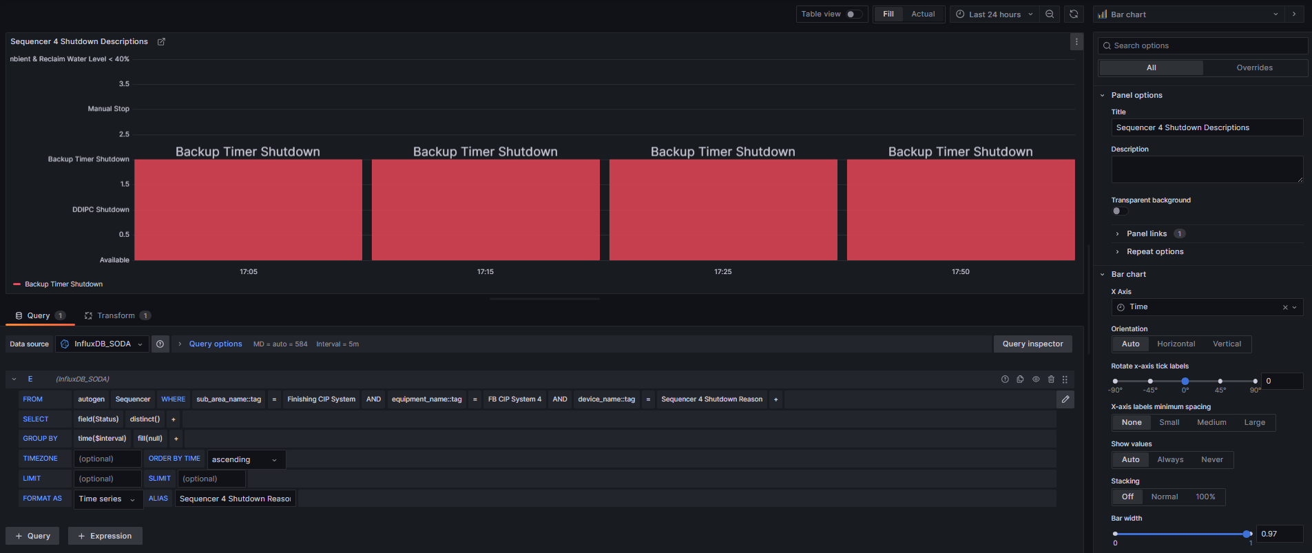
How are you trying to achieve it? → I’ve duplicated one of my time series and set it as a Bar Chart and tried a couple variations to try and format it the way I want it but have been having no luck.
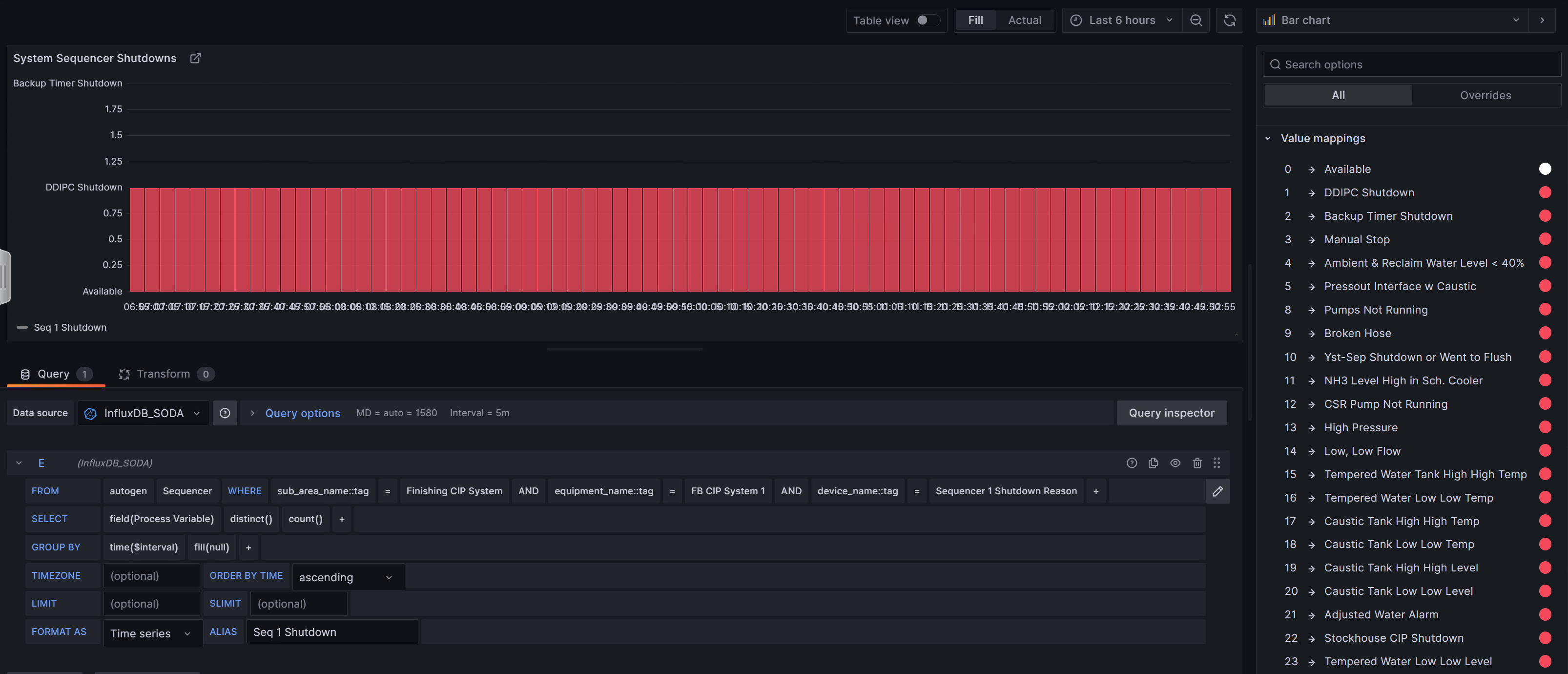
What did you expect to happen? → I want the “Seq 1 Shutdown” to be on X axis and count on the Y axis. Time shouldn’t be part of this visualization.
Can you copy/paste the configuration(s) that you are having problems with?
Did you receive any errors in the Grafana UI or in related logs? If so, please tell us exactly what they were. → it keeps formatting time on the X axis.
The state is at 0, and it’s counting 1 every time it appears, but it’s not totaling the count.
I attempted to create another template on SODA where the parameter is on change instead of finding the state every 10 seconds but that doesn’t yield any responses:
I’ve seen solutions online for uploading a flat table and creating a bar graph that way, but I need the graph to be live and updating along with my dashboard.