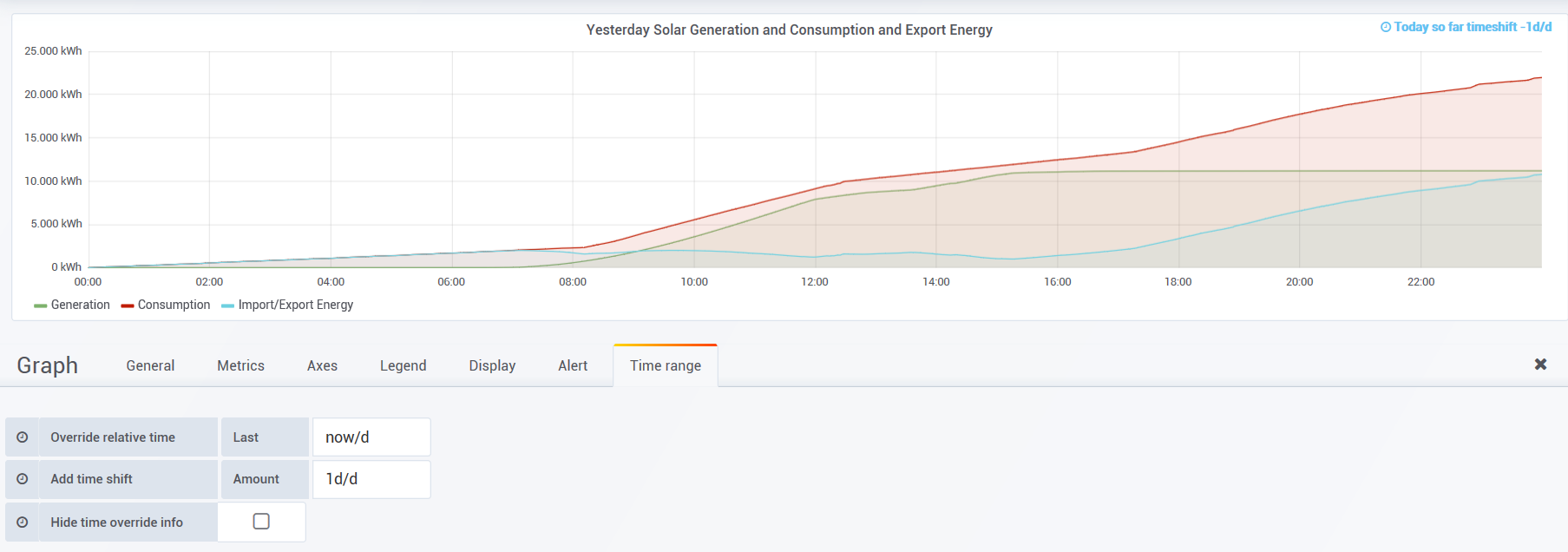
I have been trying to use override and timeshift to show results for yesterday in a time series graph that just displays yesterdays measurements for the 24 hours.
I have tried all sorts of combinations but just can’t seem to get there. Maybe its not possible or hopefully somebody smarter than me can help. The attached pic shows the closest I can get and the settings but it is the 27 April today and it displays 25 April and part of 26 April up to the time right now. I just want to show 24 hours of 26 April.
I know this was along time ago, but what was the solution?
I want to display all my data up until Yesterday and/or up until the last whole hour.
Thanks.
P.S I am probably where you were 5yrs ago
At the risk of pointing out the obvious, I presume you already tried selecting Yesterday in the time picker? You can set this to always display (there is a checkbox when you save the dashboard).
Hi Grant,
It wasn’t a silly question however, it doesn’t work.
I also tried -1h/h because I want to limit the data i query to but neither worked. .
Thanks.
P.S I hope you can red this it’s all white on my iPad
Thank you that’s just what we are looking for. Very much appreciated. I was looking to display the past 3 hours however we have a moving average which was displaying odd data at the end - your -1m/m (-2m/m in our case) worked perfectly.
Unfortunately, I jumped the gun. The race conditions where such that things looked good but sadly not.
As you can see the chart displays a small branch of data to the right which has not been calculated using the moving average and thus looks odd!. I believe this is data outside of the 2m rolling average. So it all depends on when the chart is refreshed and what data is in the pipe. Thanks.
That was the example I gave but my issue was the extra period of data that appears to the right if the chart. Whatever time period I select, Grafana displays an extra point of data between the last time and the current time - thus the extra point which has not been smoothed by the moving average and frequent looks odd.
That may be the problem. I have set up an InfluxDB Cloud account (which stores data in their new iOX system) that (as you pointed out) only uses SQL in that interface. Influx correctly states that you can still use a Flux query in Grafana to query the iOX data, but I found that even some simple graphs came out slightly different looking. I raised an issue (this was months ago) and the reply was something like “We’re working on it.”