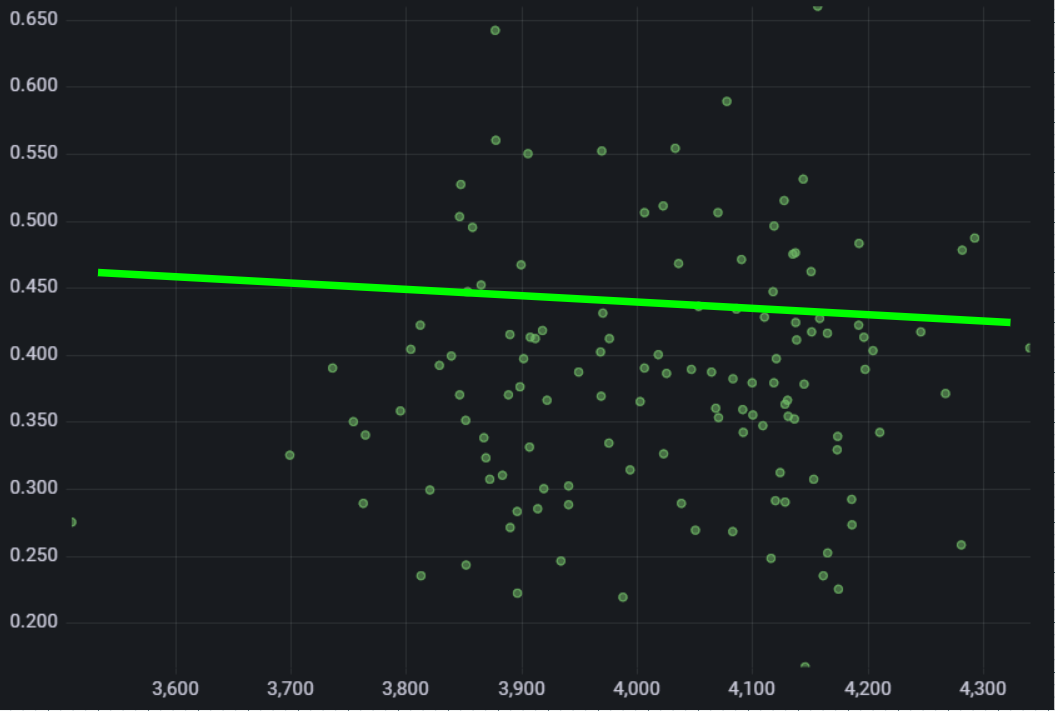
I have this XY Chart panel
I’d like to add a 1:1 line to it:
I couldn’t find a way to do it, it doesn’t seem to be possible “natively” but I also couldn’t find a way to hack it, e.g. add a second series with 2 points (0,0) and (max_value, max_value).
Thoughts?
2 Likes
This would be a great toggle feature. Discussion related to regression support (and ideally 1:1) here:
opened 10:45PM - 15 Feb 24 UTC
type/feature-request
area/panel/xychart
migrated-discussions
### Discussed in https://github.com/grafana/grafana/discussions/63173
<div ty… pe='discussions-op-text'>
<sup>Originally posted by **hafeja** February 9, 2023</sup>
Hey!
As user of plugin [XY Chart](https://grafana.com/grafana/plugins/xychart/) I'd like to request support for **regression lines** for this plugin.
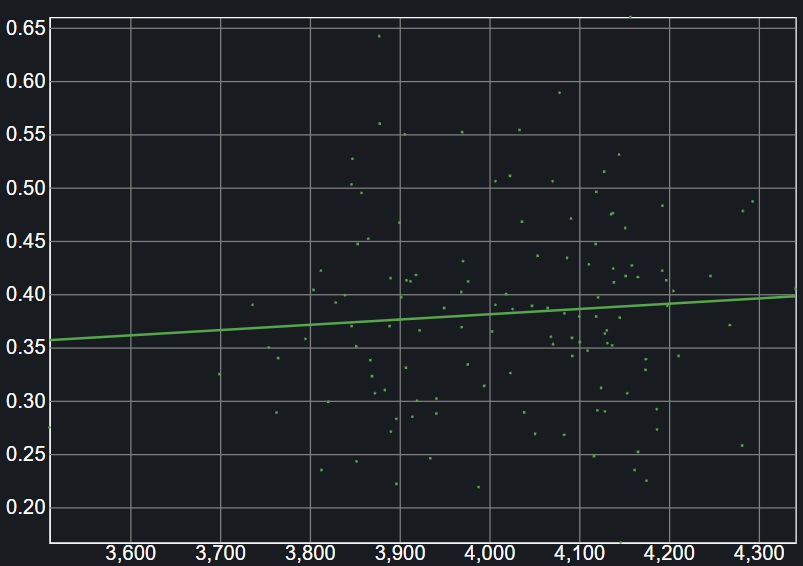
Finally, a regression line should look e.g. like this:

**Expected Benefit**
A regression line transports the key message of a scatter plot to dashboard viewers **at a glance**.
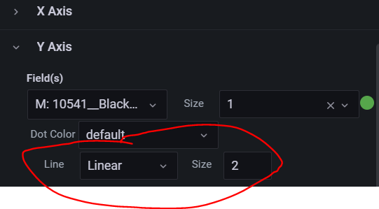
It would be good to support different kinds of regression lines (Linear, Exponential, Power, ...) similar to the ones provided by the plugin [Scatter](https://grafana.com/grafana/plugins/michaeldmoore-scatter-panel/):


The **icing on the cake** would be the possibility for the dashboard creator to define the formula that is used to calculate the regression line.
</div>
Did you try Regression analysis transformation?
You may try Grafana’s Regression analysis transformation:
[Regression analysis]
To be able to use it you need to enable regressionTransformation feature toggle:
[feature_toggles]
enable = regressionTransformation

