Hi everyone
I’m trying to build a State timeline panel in Grafana to visualize when each node was online/offline over time, but the panel only shows two rows: “metric” and “state”, instead of one row per node.
Here’s what I’m using:
Environment
- Grafana version: 11.3.1
- Datasource: PostgreSQL
DB schema
CREATE TABLE IF NOT EXISTS nodes (
node_id text PRIMARY KEY,
name text NOT NULL,
user_name text,
namespace text,
first_seen_at timestamptz DEFAULT now()
);
CREATE TABLE IF NOT EXISTS node_status (
ts timestamptz NOT NULL DEFAULT now(),
node_id text NOT NULL REFERENCES nodes(node_id) ON DELETE CASCADE,
status text NOT NULL, – ‘online’ | ‘offline’
last_seen timestamptz,
PRIMARY KEY (node_id, ts)
);
Query
SELECT
ns.ts AS “time”,
COALESCE(n.name, ns.node_id) AS “metric”,
LOWER(ns.status) AS “state”
FROM node_status ns
JOIN nodes n USING (node_id)
WHERE $__timeFilter(ns.ts)
ORDER BY “metric”, “time”;
Format as: Table
Visualization: State timeline
What I expect
Each node_id (or name) should be a separate horizontal lane, colored green/red for online/offline over time.
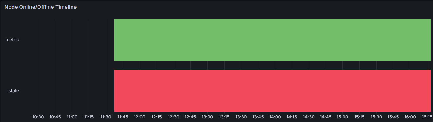
What I get
The panel just shows two lanes labeled “metric” and “state” (see screenshot), both green, no actual node separation.
Question
Any ideas on how to make Grafana treat “metric” as the series (one row per node)?
In the bottom you can see the result, but I want instead of metric, state to have node_id (or even better: node name) for each row.