Hi everyone,
I’m quite new to Grafana and InfluxDB, but I’d like to accomplish the following; I have an external service which basically is being used to verify a person his/her identity document. After a few minutes the service calls a callback URL of mine with some params. Now I’d like to use a stat visualization (or a different one if there’s a better option), to basically show a ‘green box’ if for example the status is approved and a ‘red box’ for everything else.
Data example;
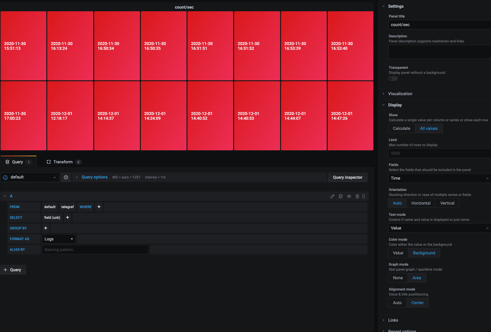
Current panel
(Set based on the default thresholds)
Maybe there’s other/better solutions than the stat visualization?