Hello everyone.
I’ve been banging my head on a wall for quite some time with this one.
I have a bunch of API calls logs.
These logs include a variety of information, of which I’ll only need: The method (get/post/…), the msg (the API path), the status (http status), the respTime (response time in ms).
I need to build a table that displays:
A total count, per (message+method+status). For which I’m required to provide:
The average response time.
The median response time.
The quantile 0.95 response time.
How do I get all that on the same visualization ?
I tried to join queries but I’m struggling.
I feel like no visualization example I found online covered that type of scenario and couldn’t find anything I could get inspiration from.
Right now, I’m trying to build something (a custom label ?) made of the concatenation of the string “(msg + meth)”, which would then allow me to have multiple queries being joined by that label. Is that the right path ? Still not completely sure on how to achieve that. (looking at the “line_format”, maybe ?)
Any advice, example or help would be welcome.
Thanks.
Unless you have a reason that you absolutely have to achieve all that in “one” query, I’d recommend you to do three queries instead (you can still visualize all three in one graph, of course). The queries are largely the same, except that one would be for calculating on average, one median, and one 0.95 quantile.
If you have some example logs I can try to provide more concrete examples.
Here would be a couple of logs:
{“time”:“2024-03-01T13:42:23.1894097Z”,“level”:“info”,“src”:“Http”,“client”:“”,“ip”:“0.0.0.0”,“meth”:“GET”,“msg”:“/platform/api/v1/public/parameters?key=CustomCalendaringIcon”,“reqId”:4,“respTime”:8,“status”:200}
{“time”:“2024-02-29T21:18:03.2961986Z”,“level”:“info”,“src”:“Http”,“client”:“”,“ip”:“1.1.1.1”,“meth”:“POST”,“msg”:“/platform/api/v1/clientauthentication”,“reqId”:7,“respTime”:598,“status”:200}
{“time”:“2024-02-29T21:18:03.6809561Z”,“level”:“info”,“src”:“Http”,“authMgrAuthenticateTime”:44,“client”:“client01”,“errorId”:6748809,“ip”:“2.2.2.2”,“meth”:“POST”,“msg”:“/platform/api/v1/authentication”,“reqId”:8,“respTime”:257,“status”:401}
I’d recommend you to visualize with three queries then, like so (not tested):
for average:
sum by (meth, msg, status) (
  avg_over_time(
    {SELECTOR} | json | unwrap respTime
    [$__interval]
  )
)
for 95% quantile:
sum by (meth, msg, status) (
  quantile_over_time(0.95,
    {SELECTOR} | json | unwrap respTime
    [$__interval]
  )
)
there isn’t a built-in function for calculating cumulative median that i know, but maybe 50% quantile is sufficient:
sum by (meth, msg, status) (
  quantile_over_time(0.50,
    {SELECTOR} | json | unwrap respTime
    [$__interval]
  )
)
Thanks @tonyswumac !
I really appreciate your help.
That’s close to what I had (looking at your queries made me realize I used two different interval values on mines, silly me.)
Also, I found I had one query being “instant” while the others were set to “time range”. Swapped them all to “instant” and it looks better already. So that’s definitely some progress.
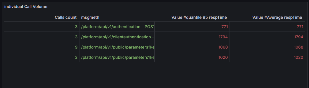
But the core of my issue is still to find out how to have all the results displayed as columns.
Right now it shows a selector for each query results:
Any idea how to mix all that under the same table ?
I thought using label_format and use that to do a join may work… but I’ve had no luck with that yet.
Edit: and the “Time” column seems irrelevant when doing a count of occurences. I need to get rid of that one as well.
Ok so added this to each query:
Then, I finally had that new label as a join option (yesterday it didnt appear there which was weird).
I guess prior to yesterday that didn’t work due to my interval being inconsistent ? Not sure.
But I’m getting exactly what I needed.
Thanks for the help @tonyswumac !