Hi Grafana Community,
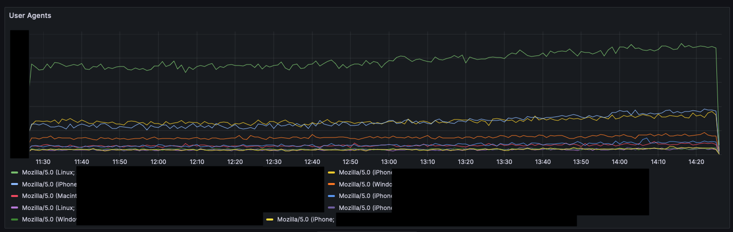
I would like to create a panel to visualize user agent trends over time. The time series should look something like this with a line for each unique user agents.

I have a GraphQL datasource that returns data in the following format:
| Timestamp | User Agent | Count |
|---|---|---|
| 2023-09-10T00:00:00Z | Firefox | 200 |
| 2023-09-10T00:00:00Z | Safari | 300 |
| 2023-09-10T00:00:00Z | Chrome | 400 |
| 2023-09-10T00:01:00Z | Firefox | 250 |
| 2023-09-10T00:01:00Z | Safari | 350 |
| 2023-09-10T00:01:00Z | Chrome | 450 |
| 2023-09-10T00:02:00Z | Firefox | 300 |
| 2023-09-10T00:02:00Z | Safari | 400 |
| 2023-09-10T00:02:00Z | Chrome | 500 |
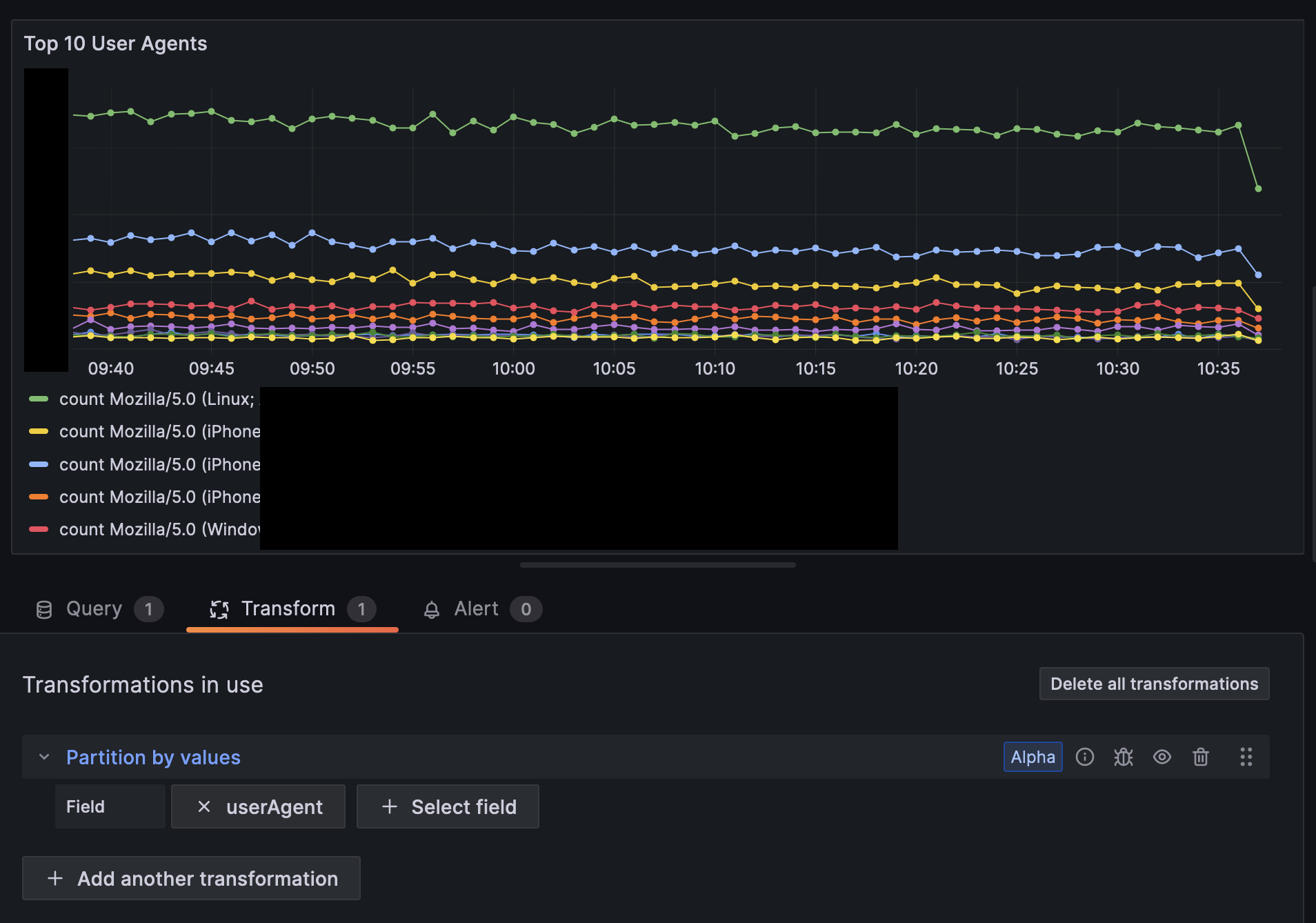
Unfortunately, if I plot this data directly, the time series ends up looking like this:

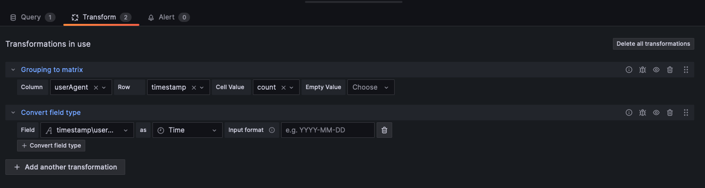
This is seemingly because the time series visualization expects a row for each timestamp and a column for each series. The data needs to be structured as such:
| Timestamp | Firefox | Safari | Chrome |
|---|---|---|---|
| 2023-09-10T00:00:00Z | 200 | 300 | 400 |
| 2023-09-10T00:01:00Z | 250 | 350 | 450 |
| 2023-09-10T00:02:00Z | 300 | 400 | 500 |
The GraphQL API I use does not allow me control over how the data is presented, so I need Grafana to transform it to a structure that can be displayed in a time series. How can this be achieved?
If it helps, I am using Grafana Cloud and the Infinity datasource plugin to interact with a GraphQL API.
Thanks a lot in advance!