Hello, this is my first post, and I just started with Grafana, this is my first project using this tool.
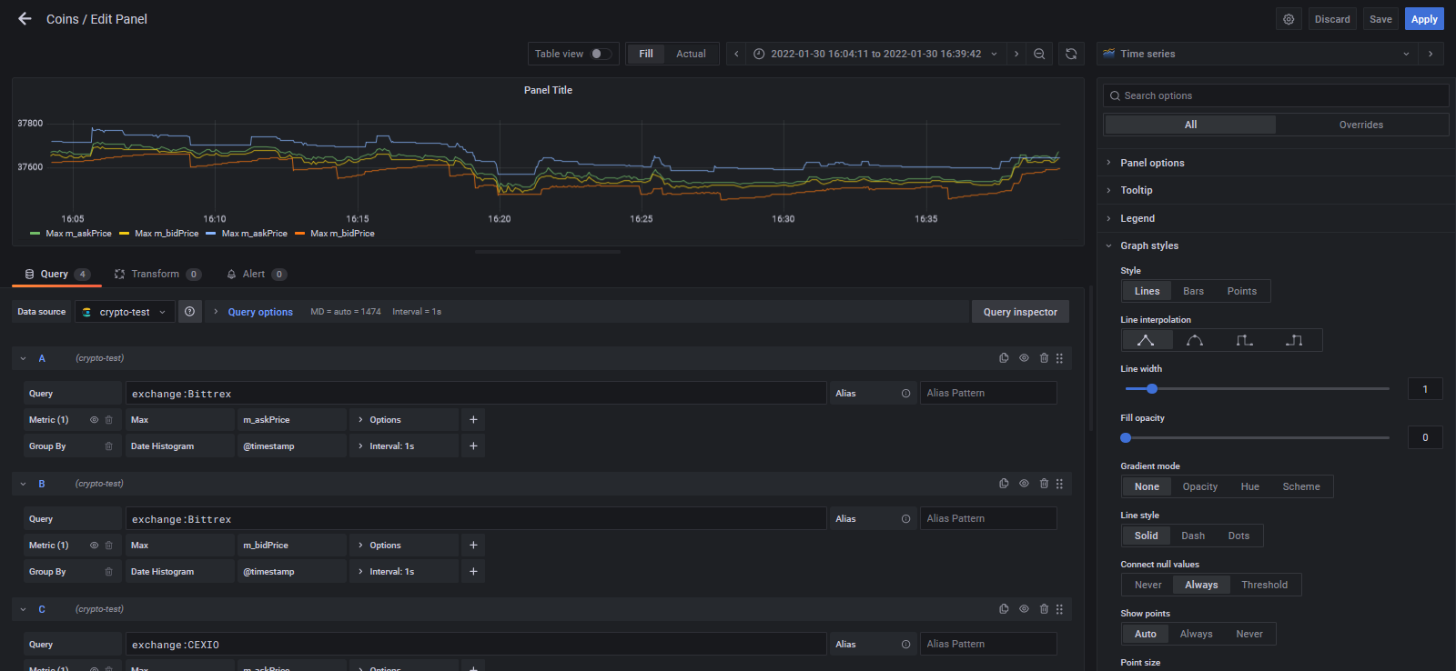
So, for each 1 second, I’m getting quotes from different exchanges and I’m saving them to ElasticSearch, and I need to plot them to see how the prices behave and compare each other. For this I need a time series with one line for each exchange (each exchange has 2 prices: ask and bid), but the most important is to see the raw data, no aggregations, and I don’t know how to do it. Also, I need to change the color of each line according to the exchange.
So far I have a time series with 4 queries, looks good, but I’m grouping the data by 1 second and this doesn’t look right.
Is this the right approach? Is there a better way with better performance?
Thanks in advance