I’m using Grafana 11, with the Infinity plugin to visualize json content. My data relates to disk performance (IOPS and latency), and has this format
iodepth    IOPS      Read_latency   write_latency
1          58,219      414,402.27      747,351.25
2         117,968     383,421.233      797,969.195
4         198,540     476,502.368      899,941.93
8         315,908     600,696.478    1,128,036.709
16        453,293     823,018.035    1,606,859.572
32        548,434   1,395,923.566    2,575,121.382
64        577,336   2,931,515.894    4,242,793.499
128       597,522   6,000,848.76     7,417,206.43
I’ve been trying to use either the Trend panel or XY chart to show these values on the same chart, but
- with Trend, the x-axis interpolates the iodepth field values and I can’t seem to find a way to prevent it - I only want to show xaxis values from the data
- With XY chart, I can set the xaxis to logarithmic, but I can only plot against a single y-axis and I need a left (iops) and right (latency).
At this point I’m handling the visualization with python/chartjs - but having the ability to just point grafana at the data would be fantastic!
Here’s what I get using the Trend and XY chart options
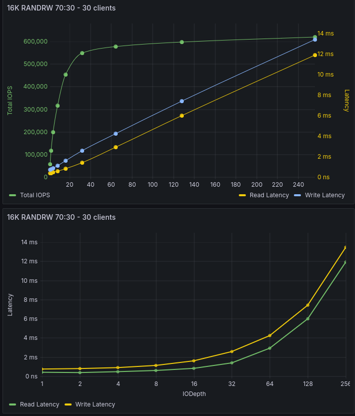
And this is what I’m trying to achieve

Is there a way to do this currently? If not would it make sense to include this kind of functionality in a future release?
