Basically, we are monitoring modems through time, and log (every 30 min) their taps (tap = switch) positions (single modem usually have more taps and one tap can have position in range of integers).
Idea is to show line graph for certain 30 min for all modems in barchart or linechart format.
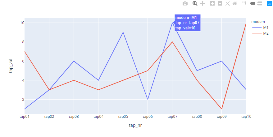
I have created such charts as toy example in python and plotly for barchart:
In that case perhaps it would be a good idea to rephrase the thread title and the question.
Perhaps it is clear from the video but very few are going to be bothered to watch a video.
My suggestion answers all the requirements of the thread title and the written text as far as I can see.
Well, from the whole video, only the picture I have put here is important.
As English is not my first language, I really don’t know how to rephrase the question.
If you have an idea, please tell, I will change it.
You answer is correct but it is not feasible to me because number of queries is dynamic. I don’t know in advance how many queries it will be.
The missing bit is the use of the word dynamic. The graph shown from the video can be accomplished just by specifying the queries, unless you need the queries generated dynamically.
Yes, graph on the picture has 12 groups, so 12 queries would be OK.
In my case I have (at the moment) cca 300 groups, and that number vary (in the future it will be larger).
This thread is already old, but in case someone else is struggling with similar problem, here’s my 5 cents.
If I understood the question correctly, I have managed to achieve something similar this way:
In the query settings:
Remove the filtering condition (where modem=M1)
Add “Group by”: tag(modem)
Define the “Alias by” as: [[tag_modem]]
Remove other queries as you do not need to have separate queries for each modem anymore
And the translation:
get data for all modems instead
grouping by a tag will create separate graphs for each value of the tag
in the legend of each group the name of the group is clumsy by default. This setting will make it look better (please try with and without this setting and you will notice the difference).
Guys, this has not been said much anywhere on Grafana forums/communities/Managed Services. But let me solve this problem once and for all.
You can have multiple lines on a single graph (through a single query) and group them by a metric by selecting a specific transformation called ‘Prepare Time Series’ and select ‘multi-frame time series’ in the drop down. Grafana will do the rest.
Hello, i have similar issue. I have 2 promethues queries in time series A and B in grafana. It is not displaying mutiple lines. Instead displaying single line. Can i please get assistance?
Thanks @vasu1070 , thsi has been a long frustration of mine, as other querying engines automatically pivot the data into multiple lines, and I could never figure out why Grafana would seem to struggle with the same queries.
Possibly grafana could improve here, by recognizing timeseries with multiple values and offering this transform in such a case.