How to graph Time Series using Dataset taken from a sql query in Echarts

Hi Community! Here I go again @mikhailvolkov and @yosiasz with Echarts plugin :smile:

Frecuently I work with time series storaged in a relational database like postgresql. I would like to start using line charts from Echarts plugin in order to build a chart similar to this in the image. I hope i could build it more beatiful

As you can see there are 5 time series (each of them in a different color). It seems so easy isn’t?.

The first challenge is to map the data from SQL query into echarts:

  • MY SQL QUERY
    SELECT
    DATETIME AS TIME,
    REGION,
    SUM(A)/SUM(B) AS INDEX
    FROM schema.table t
    GROUP BY 1,2
    GROUP BY 2,1

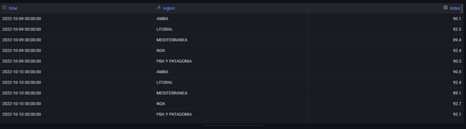
The data look like this in the image below. The “region” field has 5 unique values. In the “time” field I have a time range expresed in date format (a row per day) and in “index” field there are numerical values. So, a line in the chart is defined as:

  • A unique value in “region” field
  • A time range taken from “time” field (it can be several days).
  • A list of numerical values taken from “index” field.

To map the dimentions I decided to use “Dataset” (The echarts component). Here starts my headeaches :slight_smile: :smile: I used the following code:

let time = [],
  region = [],
  index = [];

const datablock = data.series.map((s) => {
  const time = s.fields.find((f) => f.name === 'time').values.buffer;
  const region = s.fields.find((f) => f.name === 'region').values.buffer;
  const index = s.fields.find((f) => f.name === 'index').values.buffer;

  return time.map((d, i) => [d, region[i], index[i]]);

})[0];

return {

  dataset: {
    dimensions: ['time', 'region', 'index'],
    source: datablock
  },
  title: {
    left: 'center',
    text: 'is it my best chart?'
  },
  xAxis: {
    type: 'time',
  },
  yAxis: {
    type: 'value'
  },
  series: [
    {
      type: 'line'
      encode: { x: 'time', y: 'index' }
    }
  ]
};

Here it is the chart: The sql query is the same in both charts. Unfortunatelly it looks worse!

image

So, I would like to ask some questions:

  • Is the correct way to use Dataset in this kind of Sql query for time series? I think there should be a better way to do it.
  • Is there a way to assign a color for each line according to the “region” field?

I read the documentation both apache echarts and grafana plugin but i could not improve this chart. All the examples in the documentation are built taking static data.

It would be great If you could help me with some tips :slight_smile:

Thanks in adavance.

BR
Jorge

Why not Try out the stock time series grafana viz?

Hi @yosiasz! That’s is a good question!

I’ve been working with grafana time series visualization for a long time. It’s a good and fast way to visualize time series from different sources. I’ll keep using it. However, when you need to customize the visualization there isn’t much flexibility.

When I found out Echarts plugin for grafana I proposed to me learning how to replace some visualization in order to add some customization to my dashboard. You know, for example visualization like pie charts in grafana are very very limited.

I wanted to know more about echarts plugin for grafana and start to using it more frecuently

BR
Jorge

1 Like

Gotcha. For the line chart you have above not sure what you gain more using echarts.

Anyways your question should really be posted on apache echart’s github repo as your question has nothing to do with grafana

2 Likes

Thanks @yosiasz! You’re right. it should be posted in apache echart’s github. I’ll move it.

Look at this time series visualization for instance. It’s a good example what i gain with echart

anyway, my first goals is to learn using echart grafana plugin with differens kind of visualization :slight_smile:

2 Likes

@Jorge We migrated 100+ visualizations to our Grafana instance (https://echarts.volkovlabs.io/), which helps to get started and easier to experiment than on apache.org.

I would suggest finding the best line chart similar to your use case and modifying it to use data from the data source: Grafana.

Hi @mikhailvolkov !!! Yes, I had seen them but almost all of them arent using a “Dataset” component or data dinamically taken from a relational query. I think the most challenging is to map the data from a query into each component of the visualization.

I keep working on it.

Thanks to all!

2 Likes

Hi @Jorge,

I´m struggling with a very similar use case. dataset vs series.data in Grafana with the Volkovlab eChart plugin.
How did you succeed in the meantime?

Best Jörg

1 Like

@joergsprengel I prefer series.data to the dataset. I believe I used series.data for all our projects.

We see that the community has a hard time parsing Data Source data. We are looking to improve it in the future version, having UI options for the Data Source: Add Panel options to get the data from data source · Issue #210 · VolkovLabs/volkovlabs-echarts-panel · GitHub

1 Like

@Jorge, I hope you figured it out!