-
What Grafana version and what operating system are you using? → Grafana Cloud with InfluxDB_SODA
-
What are you trying to achieve? → A consistent looking graph that shows how many times a shutdown code was issued.
-
How are you trying to achieve it? → I created a histogram with a bucket size of 1 and an offset of 0 so you can see all possible values.
-
What happened? → The graph changes. It should only be in the 2 bucket but for some reason the data is spanning?
-
What did you expect to happen? → Ideally, I’d like the graph to have the same layout as the first screenshot where every bucket can be seen and the data sticks to their bucket instead of bleeding into other buckets.

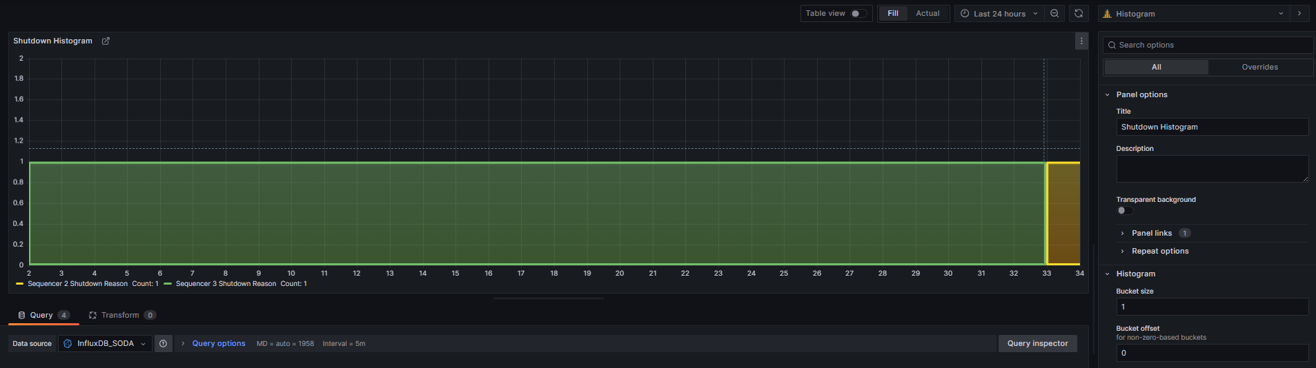

So I’ve used the min and max options to maintain the x axis, but I was hoping I could keep the buckets from expanding past 1.

Additionally, the yellow and green are two different data points, but the yellow is bleeding into the green as seen by yellow line at the bottom of the green block and the tooltip. How do I prevent this?

Can anyone make sense of why it would be doing this?
This is still an ongoing issue for me. Does anyone have any ideas?