I made a graph that displays user distribution by their app version. My request is
let Step = iff(timespan($__timeInterval) < timespan(1d), timespan(1d), timespan($__timeInterval));
cluster("").database("events").table("CourierEvents")
    | where $__timeFilter(Timestamp)
    | where Source == "courierapp" and isnotempty(CourierId)
    | summarize by CourierId, bin(Timestamp, Step), AppVersion
    | make-series Version=count() default=0 on Timestamp from $__timeFrom to $__timeTo step Step by AppVersion
As an output my data is like this

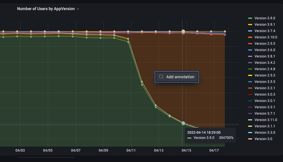
After changing Stack series to 100% my graph looks fine, but when hovering over some point the value looks like actual number * 100%. That means that 66 out of total 200 will look not like 33% but like 6600%.
Please tell me if it is fixable by panel settings or there is no other way than no change my request?