Hi there.
I would like to create a graph of the numbers of branches in a given Git repository over time. I have a large number of repositories and an even larger number of branches within those repositories and I would like to expose this to our developers.
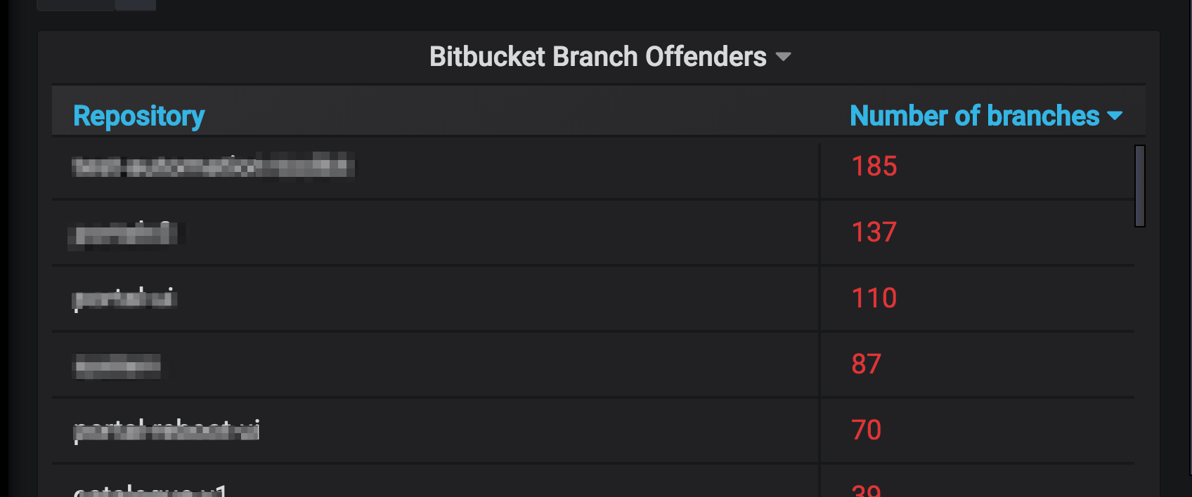
Every night I run a report that creates a single log per repository in Elasticsearch (example JSON below) that contains the repository name and the number of branches within. I currently have a table that shows this data in a dashboard sorted by the worst offenders (i.e. those repos with the most branches)
Ideally I would like my graph to show a line for each repository which will have one data point per day with the value being taken from the raw JSON document. But I can’t for the life of me figure out where to begin!
{
  "_index": "git-repo-metrics-2018-08-24",
  "_type": "doc",
  "_id": "OCk5amUBI1H2az4ppETR",
  "_version": 1,
  "_score": null,
  "_source": {
    "repo": "my-repo",
    "branch_count": 87,
    "timestamp": "2018-08-24T04:38:07Z"
  },
  "fields": {
    "timestamp": [
      "2018-08-24T04:38:07.000Z"
    ]
  },
  "sort": [
    1535085487000
  ]
}
I solved this! Whoop whoop… However unlike those awful blog posts where someone doesn’t then tell any future reader HOW they solved it…please find my screenshots below of the settings that enabled the graph view I desired…
The key to this was figuring out I needed to get the branch_count value into the metric. After several attempts of various success, I found the MAX was the most desirable aggregation. I had done this previously but no data was visible which was really confusing. The reason for this was that the Group by option was always Date Histogram and was the only grouping. Once I added the Group by to Terms == repo.keyword value BEFORE the date histogram then it all became visible.
The rest of the screenshots are how I formatted the graph to match my acceptance criteria:
Here I set Decimals to 0 as branch count is a whole number. I removed the Right Y axis and set the X axis to Time
Here I set the legend to the right hand side as I wanted to see the repo names in an easy to read table showing the min and max values of the branch count over time
Here are my settings for creating the graph with just lines and points
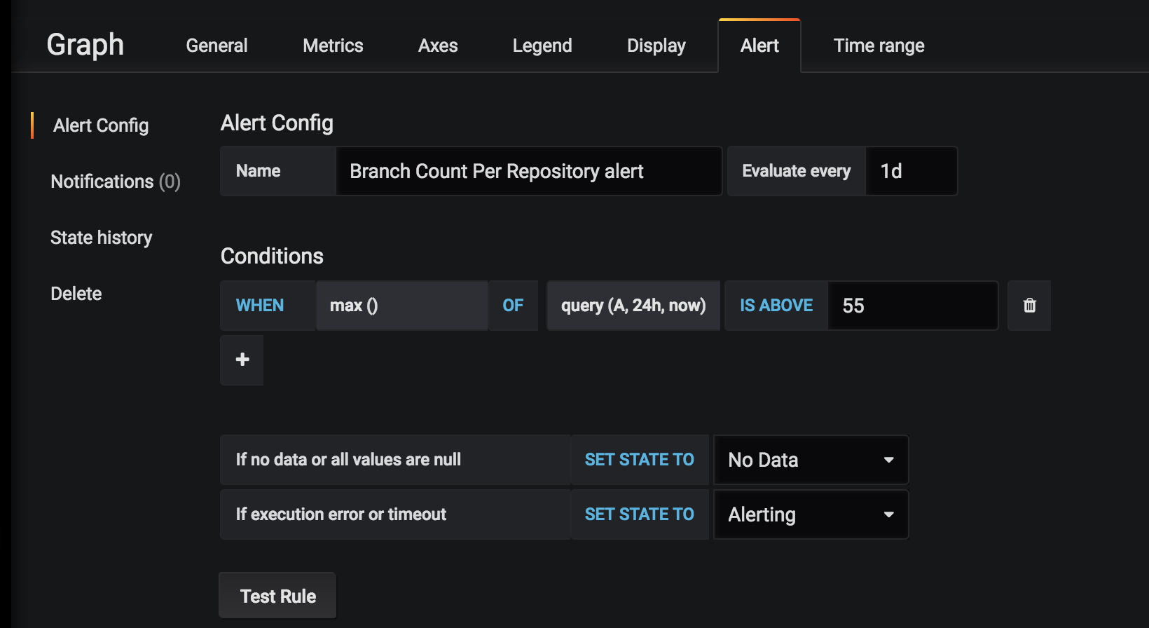
I also set some optional alerts but haven’t properly tested these yet
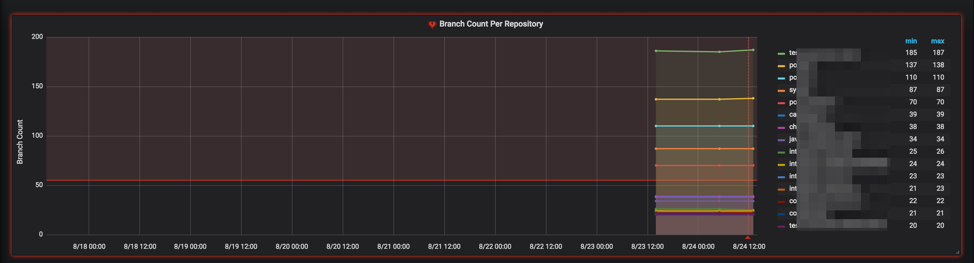
Here’s the final result