Adjusting bar chart's stacked columns' legend and colours

I am trying to visualise the following data on a bar chart:

select * from sample_data;
         creation_time         |  name  | duration_1 | duration_2 | duration_3
-------------------------------+--------+------------+------------+------------
 2022-06-15 12:15:35.793276+01 | task 1 | 00:01:00   | 00:02:00   |
 2022-06-15 12:26:18.38436+01  | task 2 | 00:02:00   | 00:03:00   | 00:05:00
 2022-06-15 12:41:53.263764+01 | task 3 | 00:04:00   | 00:09:00   | 00:01:00
 2022-06-15 12:42:37.732668+01 | task 4 | 00:01:00   | 00:05:00   | 00:08:00

The visualisation I have in mind is something like the following (photoshopped) screenshot.


Notice the X axis is the time, with a metric or category represented by column “name”.

The query I am using is as follows.

SELECT
  $__time(creation_time),
  name as metric,
  (EXTRACT(epoch FROM(duration_1))) as duration_1,
  (EXTRACT(epoch FROM(duration_2))) as duration_2,
  (EXTRACT(epoch FROM(duration_3))) as duration_3
FROM
  sample_data
WHERE
  $__timeFilter(creation_time)

So far, formatting the query as “Table” gives a very close result. Please see below.

If I format it as a time series, The visualisation becomes the chart below.


The main issue:

  • The category and colouring become per cell, instead of per column.

Is there a way to achieve the first (photoshopped) screenshot?

Could you please post the table schema and column data types?
Maybe some DDL of the table would help

DROP TABLE IF EXISTS public.sample_data;

CREATE TABLE public.sample_data (
	id SERIAL PRIMARY KEY,
	creation_time DATE NOT NULL,
	name VARCHAR(255) NOT NULL,
	duration_1 VARCHAR (255),
	duration_2 VARCHAR (255),
    duration_3 VARCHAR (255)
);

Thanks @yosiasz . Please see below

CREATE TABLE public.sample_data (
	creation_time timestamptz NOT NULL,
	name varchar NOT NULL,
	duration_1 interval NULL,
	duration_2 interval NULL,
	duration_3 interval NULL
);
CREATE INDEX sample_data_creation_idx ON public.sample_data USING btree (creation_time);

INSERT INTO public.sample_data (creation_time,"name",duration_1,duration_2,duration_3) VALUES
	 ('2022-06-15 12:15:35.793276+01','task 1','00:01:00','00:02:00',NULL),
	 ('2022-06-15 12:26:18.38436+01','task 2','00:02:00','00:03:00','00:05:00'),
	 ('2022-06-15 12:41:53.263764+01','task 3','00:04:00','00:09:00','00:01:00'),
	 ('2022-06-15 12:42:37.732668+01','task 4','00:01:00','00:05:00','00:08:00');

1 Like

no photoshop needed :wink: just Paint

Thanks @yosiasz , is this the table format? I think the by default the first string (“metric” in this case) is the x axis. The problem happens when the table format is changed to time series.

this is the table format. why do you want it to be timeseries?

Basically the timestamp information is an important piece of information to display (either visualised as the x axis or in some other ways), along with the name column.

so where do you want it to be displayed? on the y axis like you have it in the first photoshoped image?

ideally the x axis :slightly_smiling_face:

confusing. please photshop what you want to see?

ah never mind I see what you want now. sorry

so maybe some transformation (just had 3 donuts, going to regret this)

1 Like

Sorry I realise there are 2 pieces of “time” information. I guess that’s where the confusion is from?

  • Y axis: it measures the “time” duration of the 3 columns “duration_{1,2,3}”. It should keep as it is.
  • X axis: ideally, the “creation_time” column information is also displayed".

The photoshop is the first screenshot.

In fact, @yosiasz thanks to your question. Now I wonder if this has to be done through some compromise. As the more important thing is for both pieces of information (creation_time and name) to be visible, a potential compromise is to simply “combine” the two columns, as shown below.

Would welcome if anyone has better ideas

Nice @yosiasz :clap:, let me try that too. Sorry didn’t see your reply when I posted.

1 Like

also instead of transforms maybe it could be done in the query itself?

in sql server you can do this not sure in pG

;with src
as
(
select convert(varchar(50), getdate() ,108)   as time
)

select concat('task1',' ', time) as xaxis from src

xaxis
task1 10:58:14

1 Like
SELECT
  $__time(creation_time),
  concat(name, ' ⏰ ',  to_char(creation_time,'MI:SS')) as metric,
  (EXTRACT(epoch FROM(duration_1))) as duration_1,
  (EXTRACT(epoch FROM(duration_2))) as duration_2,
  (EXTRACT(epoch FROM(duration_3))) as duration_3
FROM sample_data
WHERE $__timeFilter(creation_time)

2 Likes

Hi I am having trouble displaying data on my bar chart the way I want it to be
See screenshot below of my table. I dont know why the last two row is broken down the way it is. is there away to have it display it as one row instead of two row of the same date?

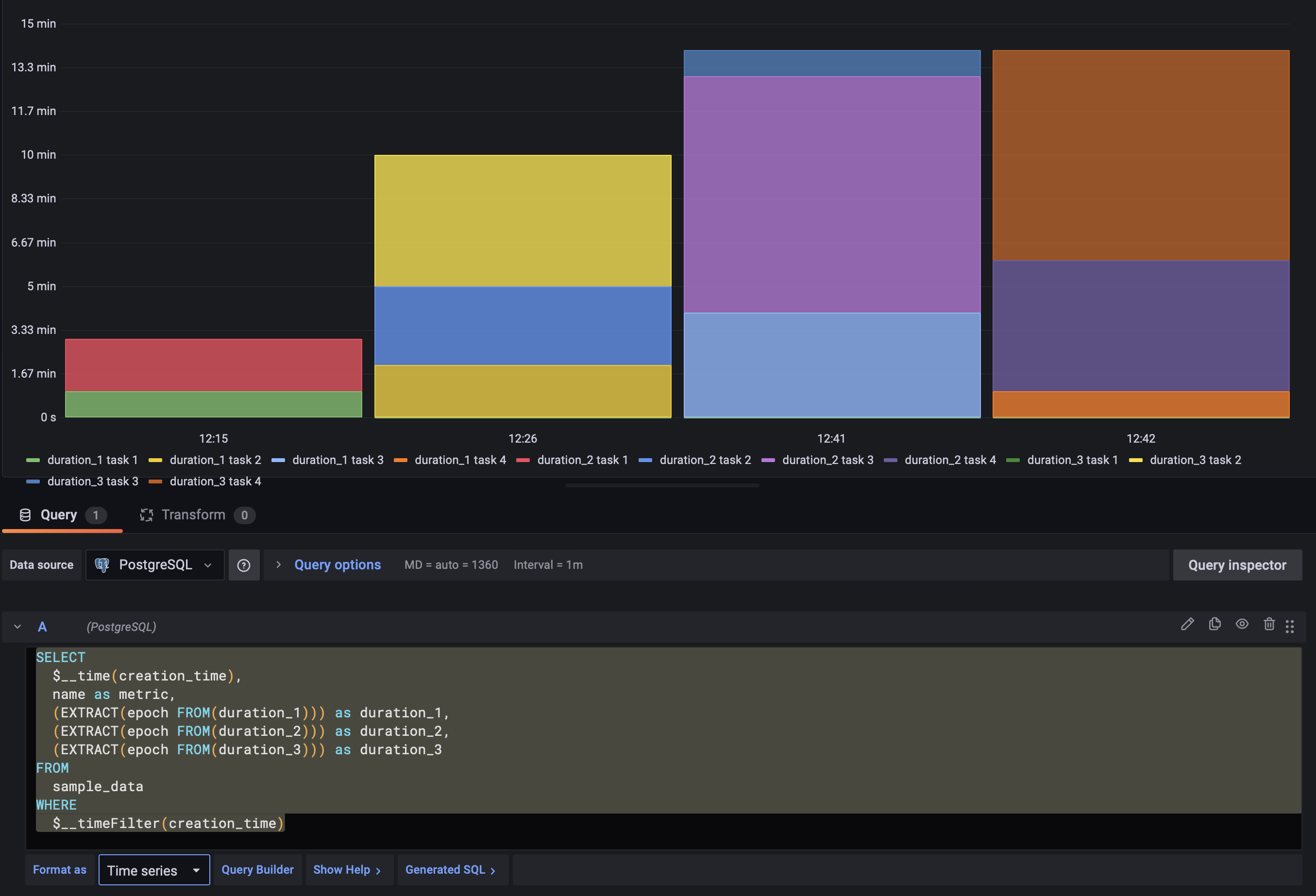
Here is a screenshot of my Bar chart

here is a screenshot of my query

SET ARITHABORT OFF
SET ANSI_WARNINGS OFF
SELECT

    CONVERT(DATETIME, AVG(CONVERT(FLOAT, Timestamp))) as Time,

--     ---This Count the amount of time the State == 3000 Meaning that unit is ON
--         COUNT(CASE WHEN IoTData.Value =30000 and IoTData.Name ='State'
--         THEN IoTData.Value 
--         END) *(0.0027777777777778) as "Total h2 Generation Time",

-- ---This Count the amount of time the xv333 == 1 Meaning that "xv333" is Energized sending H2 to Vent
--         COUNT(CASE WHEN IoTData.Value = 1 and IoTData.Name ='xv333'
--         THEN IoTData.Value 
--         END)*(0.0027777777777778) as "Send to Vent Time",


        ((AVG(CASE WHEN IoTData.Value >400  and IoTData.Name in ('PSA_I','PSB_I','PSC_I','PSD_I','PSE_I','PSF_I','PSG_I','PSH_I')
        THEN IoTData.Value
         END))*(COUNT(CASE WHEN IoTData.Value >400 and IoTData.Name in ('PSA_I','PSB_I','PSC_I','PSD_I','PSE_I','PSF_I','PSG_I','PSH_I')
        THEN IoTData.Value
        END) *100 )*0.0000373)*(0.0027777777777778) as "Total H2 KG Generate" ,


          (((AVG(CASE WHEN IoTData.Value >400  and IoTData.Name in ('PSA_I','PSB_I','PSC_I','PSD_I','PSE_I','PSF_I','PSG_I','PSH_I')
        THEN IoTData.Value
         END))*(COUNT(CASE WHEN IoTData.Value >400 and IoTData.Name in ('PSA_I','PSB_I','PSC_I','PSD_I','PSE_I','PSF_I','PSG_I','PSH_I')
        THEN IoTData.Value
        END) *100 )*0.0000373)*(0.0027777777777778))-(((AVG(CASE WHEN IoTData.Value >400  and IoTData.Name in ('PSA_I','PSB_I','PSC_I','PSD_I','PSE_I','PSF_I','PSG_I','PSH_I')
        THEN IoTData.Value
         END))*(COUNT(CASE WHEN IoTData.Value >400 and IoTData.Name in ('PSA_I','PSB_I','PSC_I','PSD_I','PSE_I','PSF_I','PSG_I','PSH_I')
        THEN IoTData.Value
        END) *100 )*0.0000373)*(0.0027777777777778) *(COUNT(CASE WHEN IoTData.Value = 1 and IoTData.Name ='xv333'
        THEN IoTData.Value 
        END)) *(0.0027777777777778)) as "H2 KG Sent to Product",


        ((AVG(CASE WHEN IoTData.Value >400  and IoTData.Name in ('PSA_I','PSB_I','PSC_I','PSD_I','PSE_I','PSF_I','PSG_I','PSH_I')
        THEN IoTData.Value
         END))*(COUNT(CASE WHEN IoTData.Value >400 and IoTData.Name in ('PSA_I','PSB_I','PSC_I','PSD_I','PSE_I','PSF_I','PSG_I','PSH_I')
        THEN IoTData.Value
        END) *100 )*0.0000373)*(0.0027777777777778) *(COUNT(CASE WHEN IoTData.Value = 1 and IoTData.Name ='xv333'
        THEN IoTData.Value 
        END)) *(0.0027777777777778) as "H2 KG Sent To Vent"


FROM
  [dbo].[IoTData]
WHERE

    Device = 'PEM_Su' and Name in('xv333','State','PSA_I','PSB_I','PSC_I','PSD_I','PSE_I','PSF_I','PSG_I','PSH_I') and
       --Timestamp BETWEEN '2022-06-07T00:00:00Z' AND '2022-06-08T23:59:59Z'
       $__timeFilter(Timestamp)

       --Group by  [Timestamp]

Group by  datepart($OrderBy , Timestamp)


Please create a new topic? @giotshibangu This topic has been resolved