Hello,
version: 8.4.3
I would like to visualize the following periodic data when they are aligned to a comming time using flux query: alignTime.
Before:
After:
Using panel link for navigation, the After panel shows the aligned series within the timeRange originated from the Before state.
The timeRage is used in the flux query to get the signals to be aligned, but the resulting data series becomes smaller and less visible to the user due to the alignTime function. The greater the timeRage becomes, the less the chart-data visible.
Goal:
- How can I display the aligned signals to fill the entire X-Axis which is somehow independent from the timeRange of the dasboard?
- How can I zoom into aligned series ignoring the timeRange value?
I have seen similar posts:
- https://community.grafana.com/t/comparing-different-years-in-one-graph-from-one-data-source/74769/8
- https://community.grafana.com/t/merge-two-time-periods-on-one-chart/75491
But none was helpful.
Ideas:
- Can XY Chart help in my case? I cant see that type of panel in my list.
- Graph (old)?
I can modify the data source in the influxDb to add extra fields and tags if needed.
This function: experimental.alignTime() function | Flux 0.x Documentation is very helpful, and I need a good panel for visualization.
Thank you for your help!
It appears you have largely achieved what you require save what you note.
The issue is that the time axis should only be from 0-59 secs and you need to remove the hours and minutes and only show seconds. Then your axis will always be 0-59 seconds for all sub plots.
If you did a zoom on the lower chart it should zoom into the overlaid plots and is what you want to achieve.
What is the sampling rate of the plots? seconds?
If you could send a csv or txt file of the data in the first plot
data
    |> window(every: 1mo)
    |> experimental.alignTime(alignTo: 2021-01-01T00:00:00Z)
Try window(every: 1sec)
If you want to do it by year, remove year and leave months
If you want to do by month, remove year and month
If you want to by days remove year, month and day.
In SQL queries this is normally done by using a GROUP by time period or using a pivot table in excel.
Hello,
Thank you for your reply!
The sampling rate is fixed on 100Hz, but each plots arrives as random event in time, but tagged with ‘cycle’ key. I have attached a sample data exported in csv from influxDb, I hope it helps.
Example dataset: https://file.io/RJX5Bw4gfDK1
I have tried what you suggested without any success
In the generated example data, each plot length always less than 1min.
Query:
import "experimental"
import "experimental/polyline"

from(bucket: "v6")
  |> range(start: v.timeRangeStart, stop: v.timeRangeStop)
  |> filter(fn: (r) => r["_measurement"] == "cp_series")
  |> filter(fn: (r) => r["machine"] == "${machine}")
  |> filter(fn: (r) => r["mold"] == "${mold}")
  |> filter(fn: (r) => r["version"] == "${version}")
  |> polyline.rdp(epsilon: 1.5)
  |> window(every: 1m)
  |> experimental.alignTime(alignTo: v.timeRangeStart)
  |> yield(name: "mean")
I did not even see the transformation of the X-Axis domain to 0 - 59.
Do I miss something?
Try |> window(every: 1sec) not 1 min.
Also, the dataset has been deleted!
Hey!
Here is the new link: Upload Files Easily | Free File Upload and Sharing Up To 10GB | I hope it works.
With 1 sec here is the result:
Thank you for helping!
Hi Daniel,
Ok I did some off-line analysis on the data you sent to try and see what the issues are.
The main and tricky issue is that the profile is 100% repeatable and thus does not reflect any errors.
As I understand matters you have a cycle time of 0-34.3 seconds repeated every 0.1 sec or 10 HZ.
This cycle is repeated for each name once every third cycle and repeated 64 times for each name or a total of 192 cycles.
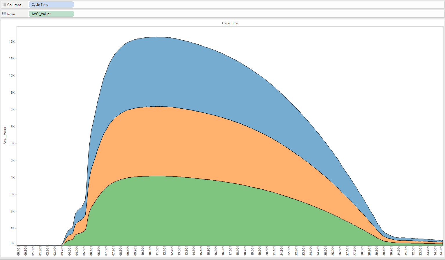
Here is a chart that I did in Tableau which shows this
If one removes the name then the same chart becomes
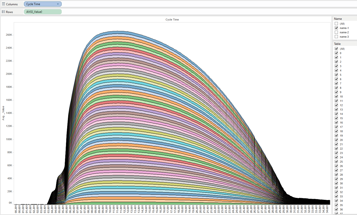
and if one removes the Tables then one gets. Note here the charts are stacked to show the difference otherwise they are all identical.
The same is repeated just for name 1 for each Table
And again for all 3 names
I also created pivot chart in excel which shoes the same for all tables and names
The only difference is that I stipped off the date and only left mm:sss.000 so that the CycleTime for each table for each name was the same.
All I did was to change _time from 2023-01-19T19:00:00.001Z to cycle time 00.001 and I used this for the time axis and simply grouped all tables by cycle time.
| t ime |
CycleTime |
_value |
| 2023-01-19 19:00:00.001 |
00.001 |
0 |
| 2023-01-19 19:00:00.101 |
00.101 |
1 |
| 2023-01-19 19:00:00.201 |
00.201 |
4 |
| 2023-01-19 19:00:00.301 |
00.301 |
0 |
| 2023-01-19 19:00:00.401 |
00.401 |
1 |
| 2023-01-19 19:00:00.501 |
00.501 |
1 |
| 2023-01-19 19:00:00.601 |
00.601 |
1 |
| 2023-01-19 19:00:00.701 |
00.701 |
1 |
| 2023-01-19 19:00:00.801 |
00.801 |
3 |
| 2023-01-19 19:00:00.901 |
00.901 |
4 |
| 2023-01-19 19:00:01.001 |
01.001 |
3 |
| 2023-01-19 19:00:01.101 |
01.101 |
4 |
| 2023-01-19 19:00:01.201 |
01.201 |
1 |
| 2023-01-19 19:00:01.301 |
01.301 |
3 |
| 2023-01-19 19:00:01.401 |
01.401 |
3 |
| 2023-01-19 19:00:01.501 |
01.501 |
1 |
| 2023-01-19 19:00:01.601 |
01.601 |
4 |
| 2023-01-19 19:00:01.701 |
01.701 |
0 |
| 2023-01-19 19:00:01.801 |
01.801 |
0 |
| 2023-01-19 19:00:01.901 |
01.901 |
3 |
| 2023-01-19 19:00:02.001 |
02.001 |
3 |
| 2023-01-19 19:00:02.101 |
02.101 |
3 |
| 2023-01-19 19:00:02.201 |
02.201 |
3 |
| 2023-01-19 19:00:02.301 |
02.301 |
4 |
| 2023-01-19 19:00:02.401 |
02.401 |
3 |
Here is the graph in Tableau with the required grouping by Cycle Time
I will use the same data to import as csv into GRAFANA and see what transpires but will do so in another post.
Maybe try a windows of 34.3 sec
Cheers
Greg Diana
Hi Daniel,
I appear to have resolved the issue but not without some head bashing!
I had to use the INFINITY datasource and its csv input option and cut and paste your data inline.
However, for whatever reason GRAFANA appears not to be able to handle millisec data so I had to create one in the ini setup file as shown below
I appended .000 to ss as ss.000 and created a new interval millisec as shown above.
I also had to strip the T and Z from the timestamp in your data as it resulted in invalid time data!
This might be a plugin issue.
After I did all these the GRAFANA Time Picker worked ok as seen below
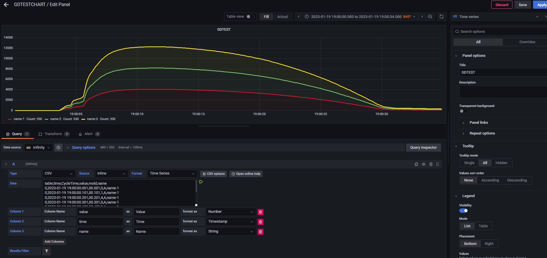
As you have lots of data I initially only used a small subset (350) and I imported as a time series as shown below
Unbeknownst, I found that the Time Series Chart is able to stack data automatically (no stack option available). It did this by using name as the third column name option as shown below
One may then click your mouse on any of the legend items and it will show each graph individually as shown below if you use the name (name-1/2/3) and assign each a different colour)
I duplicated to show this more clearly
If you do not use the colour override then it does not stack the graphs as shown below
Here it did not stack the graphs, but overlaid them.
Finally, I did a merge transformation and since all value data were identical it realised a single plot as shown below.
So with these changes, I was able to achieve an almost identical outcome to my previous post with excel and Tableau.
Hope this helps.
Wow! Thats a lot of help! Let me try!  Thank you so much for your effort!
I can make it work based on your example. The key was to use pivot on values so that timeSeries build in stacking did the job:
I have only one question remains:
The chart’s X axis and the influx query uses the timeRange provided by the grafana. This is OK, but how can force the TimeSeries chart to use different time range to fit the data best for visualization?
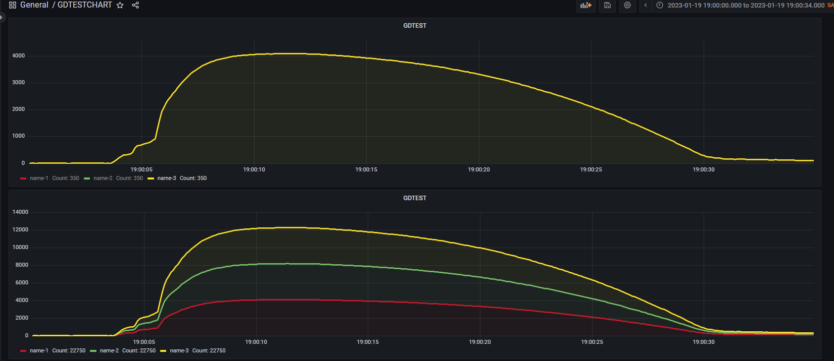
In this case, I noted that each profile had 350 values. As I changed the time to enable millisecs I changed the Query Options to

or
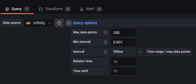
This ensures that the profiles use the optimal time range to accommodate all the points which is 100ms.
You can also perform a ZOOM TO DATA.
Hope this works?
Thank you so much for your help!