Hi. I have a text panel that is showing and HTML image. The panel content is as follows:
<a href="myLinkURL" target="_blank"> <img src="myImageURL.jpg" alt="Weather Camera" style="max-width:100%; height:auto; margin-left:auto; margin-right:auto;" id="roof";' /> </a>
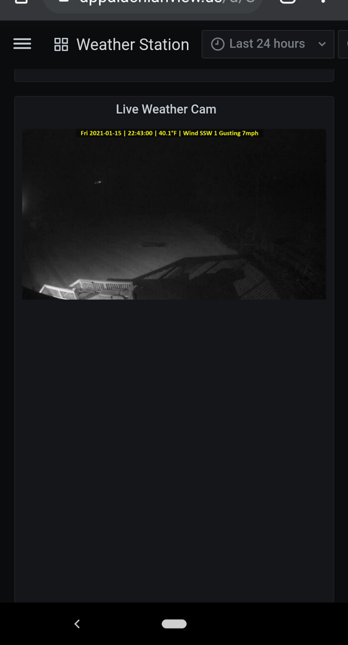
I size the panel on my desktop, such that the image proportionally fits in the space and looks nice. When viewed on my phone, the image proportionally resizes as expected just like I want. BUT, the panel vertical height stays huge. So you end up with a bunch of empty black space below the resized image. These two screenshots show what it looks like on the desktop (as it should) and what i looks like on a mobile phone (wacky).
Is there any way to make the text panel properly resize vertically to match the content of the panel?