|CREATED_DATE|ID|STATUS|ID_TYPE|
|12-Apr-24|5-123456|Order Placed|Order|
|14-Apr-24|5-999999|Order Placed|Quote|
|14-Apr-24|1-13EJPU9|Converted|Lead|
|14-Apr-24|1-037733|Order Placed|Quote|
what are you expecting the pie chart to look like?

@vijaydaresforyou on Grafana Play you can see examples of how pie charts are done, I recommend specifically looking at how the data is formatted that goes into them
https://play.grafana.org/d/ktMs4D6Mk/5-bar-charts-and-pie-charts?orgId=1&tab=query
You’re looking for pie charts that display numbers and relative percentage distribution, but that is not in your input data, which is just a list of orders that were placed. To make these pie charts, you’re going to need to aggregate your data into a set of counts. It looks like you’ve got pipe delimited text data, so what you might do is aggregate by ID_TYPE counts of the number of records you’ve got, and then put that data into a pie chart.
This can be done by investigating transformations in Grafana
Thanks Davidallen5, this is the data I am trying to Visualize.
| CREATED_DATE | ID | STATUS | ID_TYPE |
|---|---|---|---|
| 12-Apr-24 | 5-6373373 | Order Placed | Order |
| 14-Apr-24 | 5-467274 | Order Placed | Quote |
| 14-Apr-24 | 1-16EJPU5 | Converted | Lead |
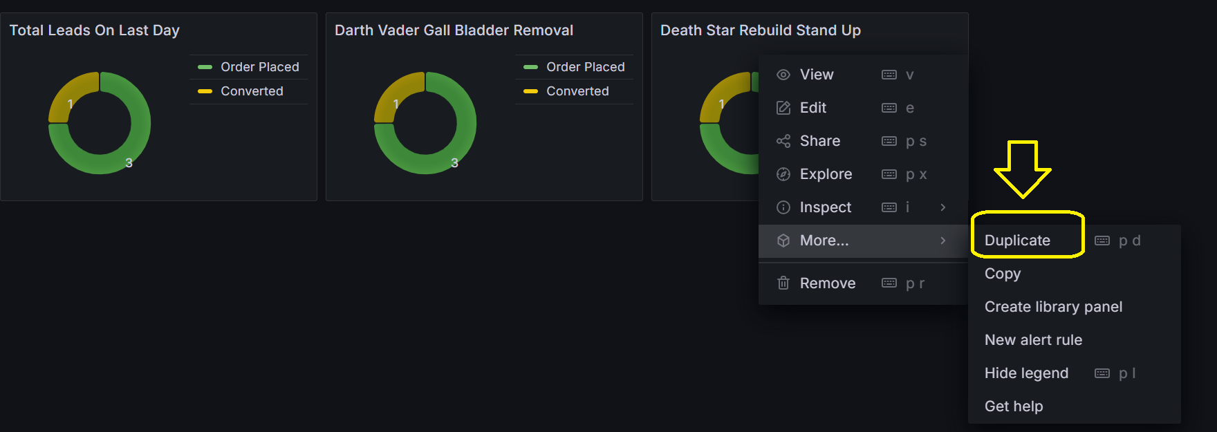
you create distinct panels within the dashboard
Thanks Yosiaz, how can we have distinct panel within the dashboard.