Issue on plotting Bar Graph

Hi,

I am using InfluxDB + grafana 3.0

Bar graph not support for single row, it shows as point.

So same single row duplicate to 3 rows with different time_series .
Now i am getting either 3 bars or 2 bars based on group by “time interval” and zoom option, But i am not able to get single bar
Can some one help me on how to get single bar.

Sample: View and query

time_series ets unique_id usr

1490859531962600 2,441 1490859531962507 us2
1490859531964600 2,441 1490859531962507 us2
1490859531966600 2,441 1490859531962507 us2

SELECT mean(“ets”) FROM “test_results_metrics_view” WHERE “unique_id” =~ /$unique_id$/ AND $timeFilter GROUP BY time($interval), “usr” fill(null)

The bar graph shows the data that is returned from the query. In this case, the query is returning 3 rows. If I understand correctly, you want to group these three rows into one row?

  • What value have you set for the Group by time interval field? These values look very close together in time if you set the value: >10s then they should be grouped as one.
1 Like

Yes, I want each usr column (us01) as one bar.

If Group by time interval field >1s , I am getting for each usr column 4 bars. so totally 24 bars
If Group by time interval field >3s , I am getting for each usr column 2 bars. so totally 12 bars

If Group by time interval field >10s i am getting single point for each usr, not single bar

Below is my query and data. Same data repeated with 4 different time_series with interval 1sec and each usr column data interval is “8s”

Please help on this

QUERY

SELECT mean(“ets”) FROM “test_results_metrics_view” WHERE “unique_id” =~ /$unique_id$/ AND $timeFilter GROUP BY time($interval) “usr” fill(null)

time_series ets unique_id usr

1489583640000 76 1489608736516267 us01
1489583641000 76 1489608736516267 us01
1489583642000 76 1489608736516267 us01
1489583643000 76 1489608736516267 us01

1489583651000 73 1489608736516267 us02
1489583652000 73 1489608736516267 us02
1489583653000 73 1489608736516267 us02
1489583654000 73 1489608736516267 us02

1489583662000 74 1489608736516267 us03
1489583663000 74 1489608736516267 us03
1489583664000 74 1489608736516267 us03
1489583665000 74 1489608736516267 us03

1489583673000 93 1489608736516267 us04
1489583674000 93 1489608736516267 us04
1489583675000 93 1489608736516267 us04
1489583676000 93 1489608736516267 us04

1489583684000 86 1489608736516267 us05
1489583685000 86 1489608736516267 us05
1489583686000 86 1489608736516267 us05
1489583687000 86 1489608736516267 us05

1489583695000 89 1489608736516267 us06
1489583696000 89 1489608736516267 us06
1489583697000 89 1489608736516267 us06
1489583698000 89 1489608736516267 us06

I think what you are asking for is the x-axis Mode feature for the Graph panel. The default is to to show a graph for a time series but you can also choose to graph per serie rather than per time interval.

Here is an example: http://play.grafana.org/dashboard/db/graph-styles?orgId=1&panelId=19&fullscreen&edit&tab=axes

1 Like

Thank you so much . But this option is not available in Grafana 3.1.1. Which release of Grafana this option available.

As above shared link, grafana shows version 4.3.0 . should i use this version?

I think it got added in version 4.0.

1 Like

I am having 4.1.1 windows, even 4.1.1 version this option not available . Any way i will download 4.3 and try this option. Thank you so much for your quick help .

I just tested version 4.1.1 and it does have that option.

Thank you so much . By using 3.1.1 version i made these graph by adding one more null “usr” row for each “usr”.

But one scenario , If I have one “usr” . So I am not getting single bar. is bar graph requires minimum 2 “usr” while using group by “usr”.

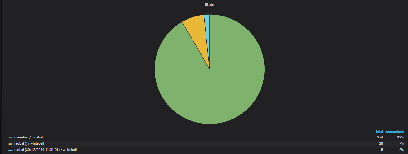
i am falling same type of problem. in my mssql server i saw that my state result is
GrafanaMsg1
the query is ( select count(*) , tx_state from T_ATM group by tx_state )

when i am use time series in my grafana the dashboard look like


grafana time series query is
DROP TABLE IF EXISTS #TMP1
SELECT dtt_mod = CAST(dtt_mod AS DATE)
, tx_state

INTO #TMP1
FROM T_ATM

WHERE $__timeFilter(dtt_mod)
GROUP BY tx_state, dtt_mod
ORDER BY CAST(dtt_mod AS DATE)

SELECT $__time(dtt_mod)

, count(*)
, tx_state

FROM #TMP1
GROUP BY dtt_mod,tx_state
ORDER BY dtt_mod ASC

i do not understand how i will get mssql server result show in grafana pie chart or histrogram or graph e.t.c