We have created a time series graph, in order to display the 4xx and 5xx errors in some of our application load balancers, fetching data from Cloudwatch.
However, we have noticed the following behavior: When none of the load balancers is selected, the colors in the legend and the lines in the graphs don’t match. However, when an individual LB is selected, the graph looks accurate.
Do you know why this is happening? Is this a bug or have we configured something in the wrong way?
Yes, we are using the Cloudwatch plugin. We are querying the Cloudwatch metrics, and in this case we are using a predefined metric, as you can see in the attached screenshot.
Make your graph higher, to make more space for legend. I guess your legend items are just not visible, because you have many LBs (there is also tiny scroll bar in the legend usually, which may not be visible). My guess is that you are only confused from the UI.
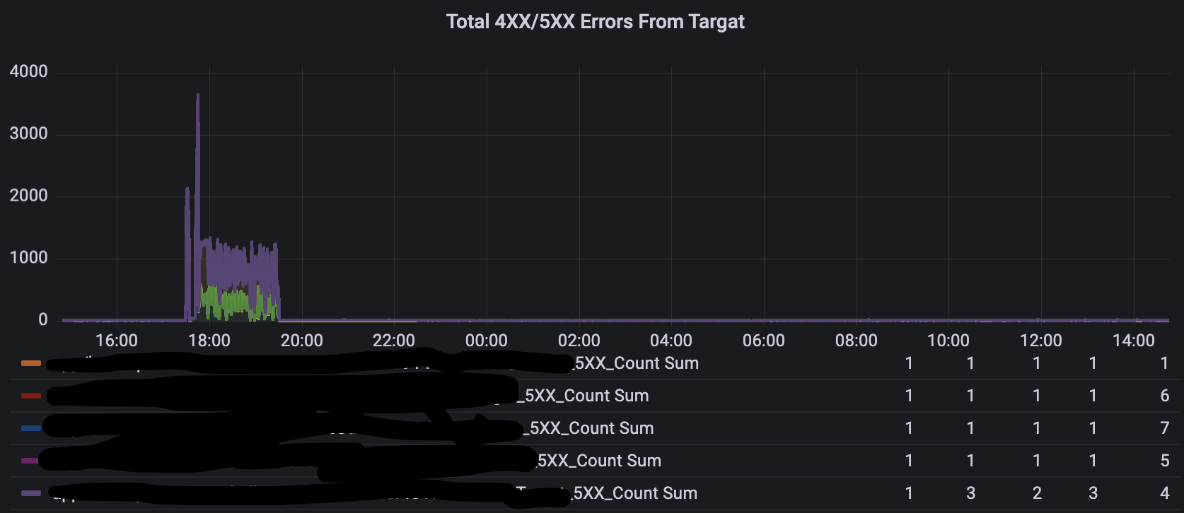
Hi @jangaraj, thank you for your response. However, that doesn’t seem to be the case. If you have a look at the screenshots below, you will see that the colors in the legend do not correspond to the graph when no LB is selected. They are changing whenever a single LB is selected:
According to the first graph, the line in the second one should be light green, instead of the one in the third graph. This means that when no LB is selected, the legend is misleading. Could this be a bug?
Apologies for the small image, but I am not allowed to post more than two individual screenshots.
I remember something like this being reported as a bug a few months back - and fixed soon after. As @jangaraj suggests, see if updating your Grafana version helps?