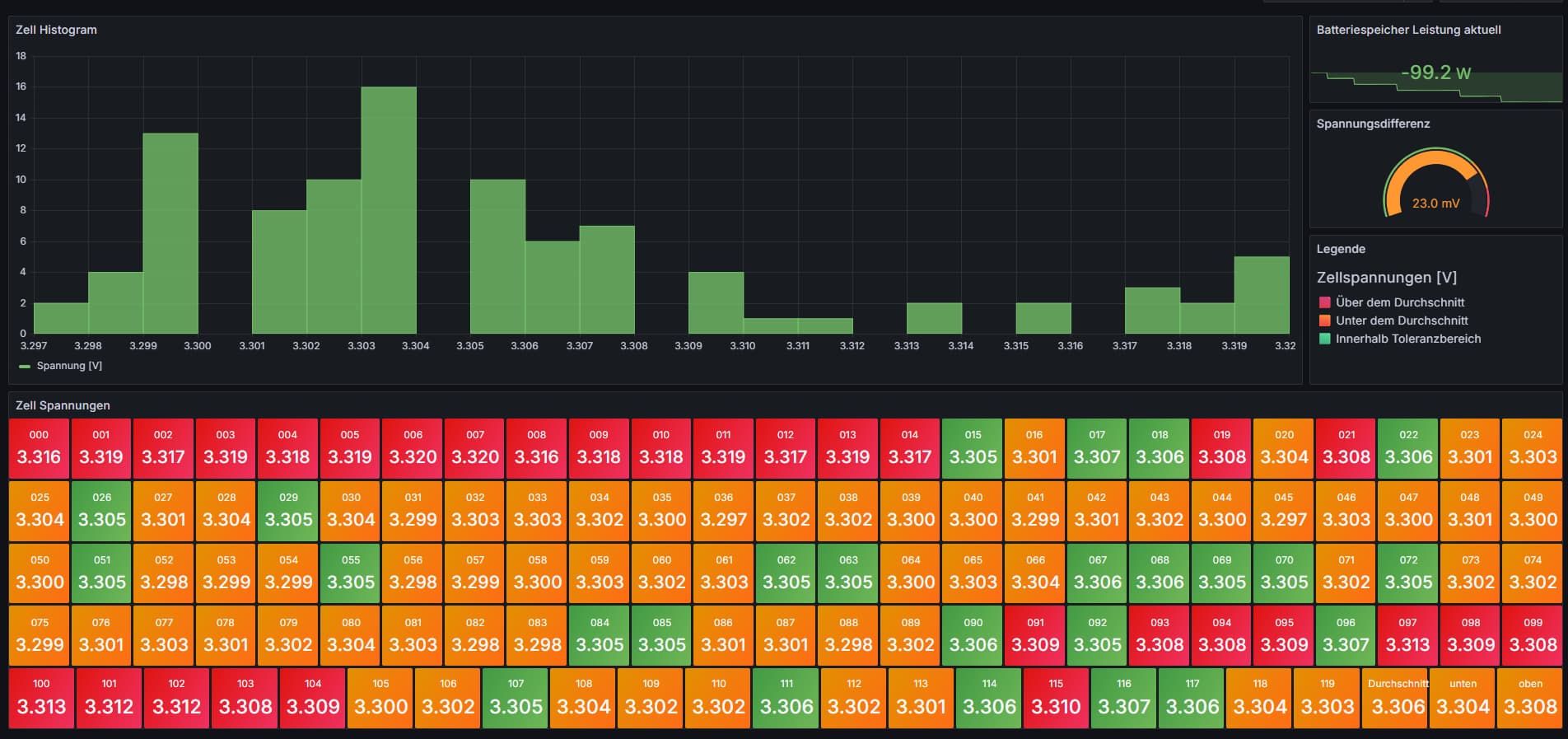
Hi everyone,
I’m currently working with a set of measurement values in Grafana ranging from 000_value to 119_value. I have two questions regarding the visualization:
1. Label formatting (axis or legend):
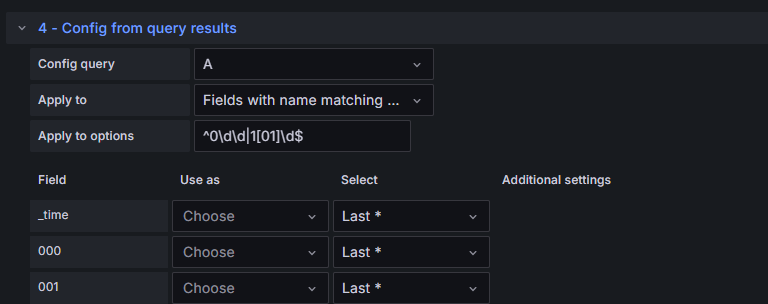
I’d like to display only the numeric part of each label (e.g., 000, 001, 002, etc.) instead of the full label like 000_value, 001_value, etc.
Is there a way to do this – maybe through aliasing in the query, regex in transformations, or a setting in the panel configuration?
2. Deviation range and highlighting outliers:
I want to calculate the average of all values and then define a tolerance band of ±0.002 V around this average. Any values outside that range should be highlighted in red.
For example, if the average is 3.3335 V, then anything outside the range [3.3315 V, 3.3355 V] should be clearly marked.
Is it possible to implement this kind of conditional formatting or dynamic thresholding in a panel (like Time series, Table, or another type)?
I’ve attached a screenshot of my current panel view for reference:
Any help or tips would be much appreciated!
Thanks in advance,
herrx