Hi,
Since the upgrade to 7.4, my graphs are showing dots instead of lines.
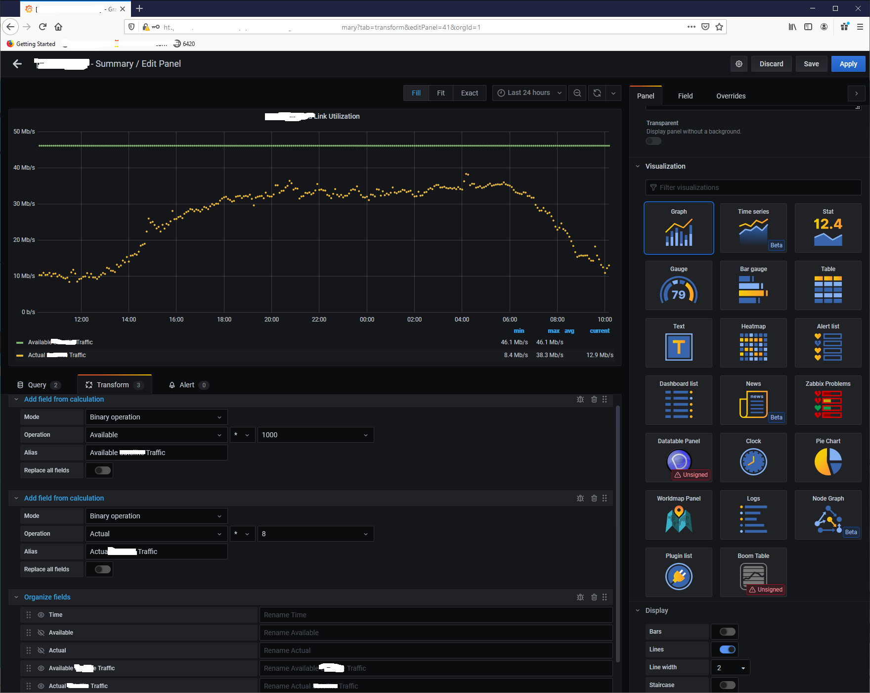
The specific of the graphs are:
- data from PRTG (I assume this is not relevant for the issue)
- two queries
- both fields/queries are transformed using calculation “binary operation”
- one “Organized fields” transformation to show only the calculation results lines in the graph.
If I remove the transformations, then the graph displays line, and not dots, but wrong values for the line.
In “Display” settings of the graph is set “Lines=ON” and “Line width=2”.
If I set “Lines=Off”, the graph is becoming empty.
See the image graphDots|628x500
I tried to use “Time series” instead of “Graph”. Using Time Series the graph also will be empty after the transformations.
I’m getting different measurements that I have to display on the same graph, I must do transformations.
Thanks!
