Hi all:
I am trying to create a graph that plots the timestamp of a sale ID being added to a database, against the count of all the sale ID numbers added at that timestamp. I want to represent this as a graph with bars for the points. Also, the bars need to be stacked bars with the count of sales from each individual sales channel. The whole bar would represent the total count of sales from ALL sales channels. So it is a stacked bar graph.
Data source is in MS SQL Server.
I also want to know if I can use the group by clause to group the time stamps by month. Then I would show the total sale IDs (stacked according to different sales channels) per month.
So far I have tried to do this by first selecting the count of sale IDs for an individual sales channel in a subquery, then selecting the count of that count outside the subquery. But this would not give me the values from each sales channel count stacked on top of each other in a bar.
the code I have right now looks something like this:
with data as
(select Date_Created, Record_ID
from [DB].[dbo].[tblImportBatchItem]
where Record_ID like ‘SALES_CHANNEL_NAME%’
group by Date_Created, Record_ID)
select count (Record_ID) from data
Does anyone have any idea how to achieve this?
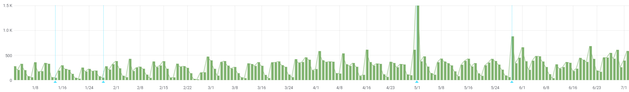
The bar graph would look like this, except with the bars having segmented colors each stacked value:
graphforforumquestiongrafana1|690x101
Any ideas or help are welcome, please. I’m new to SQL and Grafana.!