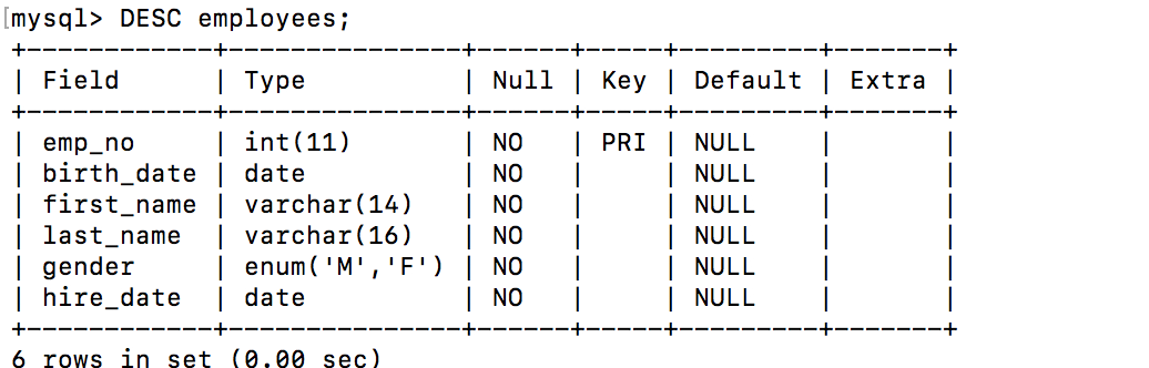
I have MySQL Tables as
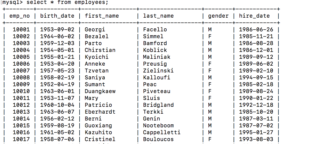
I have created first Tab;e Panel using simple query
select * from employees;
and the Table it is showing properly
Now, I’m planing to form a Graph of hiring over period of time. I formed a query as
SELECT
UNIX_TIMESTAMP(hire_date) as time_sec,
first_name as value,
'first_name' as metric
FROM employees
WHERE $__timeFilter(hire_date)
ORDER BY hire_date ASC
But I’m not getting hiring over period of time Graph, I could see the message as “No field name specified to use for x-axis, check your axes settings”.
How could I form a graph hiring over period of time using my data set ? Sorry but my basic concepts are not clear 
Hi,
Please read the time series query section very carefully of using mysql in Grafana documentation. You’ll notice that
Must be a column named value representing the time series value.
This value must be numeric. So 1 as value would for example work to plot the result in a graph panel.
Marcus
Thanks @mefraimsson, I have modified my query as
SELECT
UNIX_TIMESTAMP(hire_date) as time_sec,
hire_date as value,
‘first_name’ as metric
FROM employees
WHERE $__timeFilter(hire_date)
ORDER BY hire_date ASC
And my data is in time series but still I could not able to plot the graph.
Hi,
Good, but I don’t think hire_date as value would work that good since it’s a date type. Obviously depends on how you want to visualize this, but with a graph panel I think the result will be very odd.
Marcus
I’m ok if the graphs are not much pretty. I just want to start with my very first graph.
Mertics-> Format as -> "Time Series"
Axes-> X-Axis -> Mode -> Series
But still graph shows “No Data Points”, could you please help me what exactly I’m missing so I can plot my first graph
Seems like you have very old data, decades ago for example. Please make sure to change the time range in the upper right corner of the dashboard so that it include data within certain hire_date.
I’m not sure exactly how you want to track hires over time, but I’m guessing that hires/gender/month could be interesting. In that case I would suggest that you use the X-Axes Mode Time instead and a query similar to the following. Please note that you’ll need Grafana nightly build / v5.0 beta for the $__timeGroup to be supported with MySQL.
SELECT
  $__timeGroup(hire_date,'720h') as time_sec,
  count(emp_no) as value,
  gender as metric
FROM
  employees
WHERE
  $__timeFilter(hire_date)
GROUP BY 1, 3
ORDER BY 1
Then you could change some panel settings. Display tab -> Draw mode -> Bars and Stack checked. You can now change time range to a year where you have data in your table and it should render a stacked bar (M/F) per each month (30 days).
What I suggested would look similar to this graph: http://play.grafana.org/d/000000016/graph-styles?panelId=13&fullscreen&edit&orgId=1
What you tried to achieve earlier was similar to this graph: http://play.grafana.org/d/000000016/graph-styles?panelId=19&fullscreen&edit&orgId=1
If you still want to use the X-Axes mode series you’ll need to rewrite your query so that the value of metric will be your buckets you want to display as bars, for example year or month of hire_date.
Marcus
Thank you so much @anon34853223  , as I could see how data representation get changed over my operations it is making some sense to try out different combinations.
I’ll start exploring it 
In your Graphs I can see “Series” and builtin “Functions” are there. How that can be achived ?
The graphs i linked are using graphite datasource. The graphite datasource supports functions. You cannot use them for mysql though.
Marcus