-
Version: Grafana 9.3.6 Docker image running on Windows 10 WSL2 Ubuntu
-
Background:
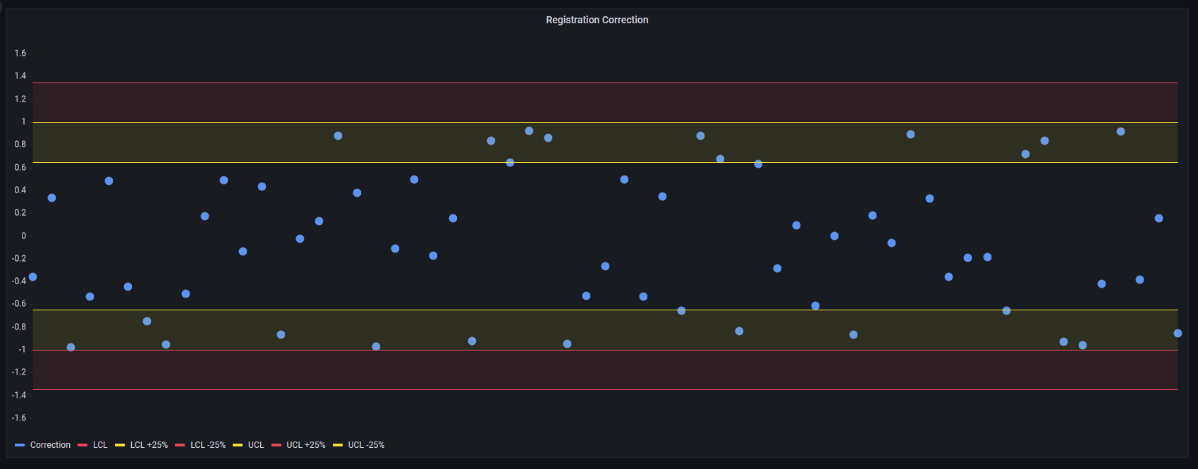
Alright, so I have a bit of a niche use case here, so here’s what I’ve successfully done so far for context. I wanted to use a time series panel to display data points representing the last certain number of points WITHOUT caring about their times. I just want something like “the last 30 points” rather than something like “the last 30 seconds” if that makes sense. I have a working implementation of this already that I hacked together by selecting an arbitrary 60-second time window to always show on the panel. I’m then feeding it with my points set within that time frame and just shifting all of their timestamps by a second into the past to make them shift to the left on the graph when a new point gets added. I know a time series panel doesn’t seem to make sense for this, but I wanted to have the colored regions configured on the graph as seen in the picture above, and as far as I can tell only the time series panel lets me do this. Despite the mess this sounds like, it DOES work fine for me so far. -
What I want to do:
Really the only thing I would like to change is the display of the times at the bottom of the chart (circled red in image above). Being that I don’t care about timestamps at all for my application, I would like to either hide them or change them to be something else relevant to my data points, like an index position for example. Is there any sort of DOM elements of the panel I could edit to accomplish this? Or better yet some sort of configuration change or panel setting in Grafana to accomplish this? -
What I’ve tried so far:
I’m using the panel embedded within a WebView2 control on a Windows .NET 6 WPF application. I’ve found that I can run a script on the embedded panel to edit the canvas size height which cuts off the time labels at the bottom, but at the cost of weirdly down scaling the size of the font for the axis labels on the left and making them blurry. I’ve also found that this script sometimes doesn’t work consistently in the WebView2 control instance. I’m hoping I can find a better solution than this from here.
The following is the script I was running to edit the canvas size by shortening the height by 12 pixels, which is enough to remove the time labels. This always works when ran in the dev tools of a browser, but gets ignored often and inconsistently when I run it on my WebView2 control using ExecuteScriptAsync even after waiting for the page to fully load. This is why I’d like to try another approach. Here’s what I ran:
document.querySelector('#reactRoot > div.grafana-app > main > div.panel-solo > div:nth-child(1) > section > div.panel-content > div > div.css-157c53p > div > div:nth-child(1) > div > div > canvas').height -= 12;
Here’s what it looks like after running that:

Looks mostly okay right? I just wish I could consistently do it or find a better way to accomplish this.
- Thoughts?
Do you think this is possible to reliably do in some way? Know of a better approach I should try? Did I miss something I could change or do better? Please let me know, I’m all ears right now. Thanks for listening to my rambling and I greatly appreciate any thoughts you have in advance!