A complex graph

I’m using the latest version of Grafana.

I’m working on a timeseries, and there is a variable(integer) that is supposed to do something like this (this is from matplotlib):

The integer is a column in a database, if the integer is 0, nothing should be done. If the integer is any other positive number, it should be filled between. On the picture the points that are highlighted (in the same rectangle) have the same integer number e.g. 32 for the first highlighted zone, and 33 for the other highlighted zone.

E.g. if the highlighter column looks like this in a few rows of data, 0,32,0,32,32,0,0,0,32,33,33 etc.
The highlighted part should be between the first 32 and the last 32 that appears.
0, |32,0,32,32,0,0,0,32,| 33,33
Also, the different values of the integer do not overlap. E.g. 33,33,32,33.

My question is, is this possible to do in Grafana? Maybe not in the fill-between background way, maybe change the color of the line connecting these points.

This is what i’ve got so far, from importing the integer columns (i know it’s bad).

The green lines should be filled between somehow (and not stick out so much)

Welcome @pavlevidanovic

What is your datasource and what is the query you used to create your graph above?

select TO_TIMESTAMP(mvp.factobservation.observation_time, ‘YYYY/MM/DD/HH24:MI:ss’)-interval ‘2H’, pocket, result_time ,

mvp.factobservation.actual_value, predicted_value, upper_bound, lower_bound

from mvp.factresult

inner join mvp.factobservation on mvp.factobservation.observationid = mvp.factresult.observationid

where mvp.factobservation.seriesid = 2 and mvp.factresult.model_name = ‘prophet’ and mvp.factresult.pocket is not null

order by result_time desc

This is the query, i don’t know how this is relevant to my question, i asked if it’s possible to do a matplotlib fill between in grafana (using an if statement)

Pushing post to recent

As @grant2 asked what is your data source , is it mysql or sql server? Or postgres

When people ask you questions in order to be able to help you, responding in the above manner does not create a conducive atmosphere for exchanging ideas. It is actually very relevant that you answer that question as we do not have access to your data. Knowing the data source will help us help you by emulating your data in our database

I understand this very well, but if i get a “no” for this question i would just switch to another visualization tool, i wouldn’t want to waste my time or your time trying to complete a task that isn’t achievable.

I apologize if you were annoyed by that.

Datasource is postgres.

1 Like

no need to apologize as I am not offended.
now that we know what database type it is. please answer the following

date types (int, float,decimal ?) for these columns

pocket, 
result_time ,
mvp.factobservation.actual_value, 
predicted_value, 
upper_bound,
lower_bound

you are not wasting my time, I am here to help. but if you feel these questions are a waste of your time then happy visualization journey

I tried it mock data and here are the results, not sure what your data looks like that is causing you the issue. But in my case one of the values is way too big compared to the other values’ ranges

pocket, float8
result_time , varchar 255
mvp.factobservation.actual_value, float8
predicted_value, float8
upper_bound, float8
lower_bound float8

like i said, there is no “issue”, i’m asking if its possible to show that the pocket values are connected by coloring that part of the graph (background or connected line) a different color

E.g. i want to say: Grafana, change the background color of the timeseries from value1 to value2 for this specific variable. I tried inserting overrides but there is only the ‘‘fill below’’ option

1 Like

Hi @pavlevidanovic,

Welcome to the :grafana: community support forums !!

We are excited that you joined our OSS community. Please read about some of the FAQs in the community :slight_smile:

I moved this post to the PostgreSQL category and I can see that both @grant2 and @yosiasz are already trying to help as they both are v.active community contributors.

Grafana is cool but could be tricky to find a perfect solution and Datasoruce is one of them. Different Data Sources have different syntaxes for using variables or aliases.

Therefore, it is good to provide as much data as possible. I know that for new users it could be challenging and that is why we are continuously making more improvements to our forums so that all required information is there from the start of a post (we do have a template for this which gets created by default once someone wants to create a new post).

Let us know if you saw that template when creating a new post? We do appreciate your feedback :slight_smile:

1 Like

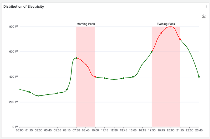
The graph in the first post looks very similar to one of the Apache ECharts examples:

The ECharts panel is not drag-and-drop, but it seems possible to visualize what you are looking for.

Example: Volkov Labs

Maybe I am missing the point here…

1 Like

Thanks for the replies guys, i managed to get it working somehow using overrides. It looks like crap when zoomed in to the max but it looks fine from afar. I’ll check out the apache graph you sent me for future reference.

2 Likes