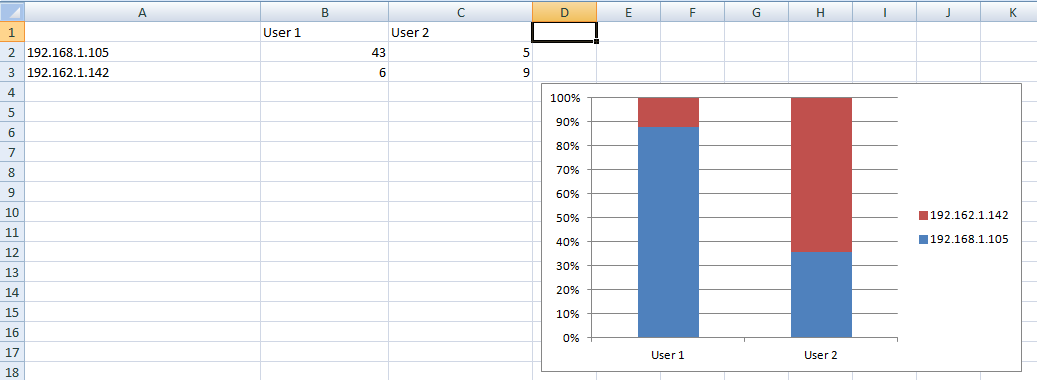
Hey there! I’m very new to Grafana and am trying to evaluate it as a network and security visualization platform for a small business. As part of security monitoring, I want to graph user logins by user and IP so that I can see, at a glance, how often any given user is logging in from specific locations on the network. I thought that an intuitive approach to that would be per-user bars split into sections by IP. In effect, I want to have an individual bar for each user totaling up their logins, then split it up and color-code it by IP.
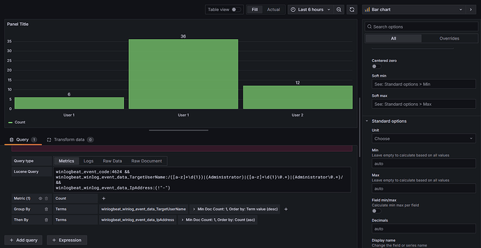
I’m querying an elasticsearch database, and can query for what I want pretty easily. The trouble seems to be stacking the bars – I have the results grouped by username, then by IP, which works great! The only issue is that I can’t seem to figure out how to stack the IPs (subgroups?) on top of each other. Below is a picture of what I’m talking about:
I took a second to mock up what I want to do in Excel. I want to do this:
I recognize I’m pretty new to Grafana, and might be taking the wrong approach, using the wrong type of graph, or trying to do this in the wrong place. If anyone has suggestions about changing the methodology or even the premise of the question, please feel free to let me know!
Grafana version: 11.2.1
Data source: Elasticsearch
Thank you in advance!


