I created a histogram metric with buckets in the range 0.1 - 1. These buckets corresponds to score and capture the frequency of each score over a period of time.
I want to draw a visualization in below format,
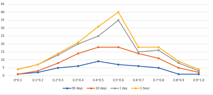
But the closest I am able to do is,

Is there a way to,
- Connect the dots through a line
- Can I plot the buckets close to each other so that line graphs superimpose on each other?