Hi, need to plot a time series with Historical average vs current day with Influx. Could you please shed a light on this…
Welcome to the forum. Can you explain in greater detail what you mean by historical average? If the current day (3-Aug-2021) value was, for example, 105, are you looking to plot (on the same graph) the value from yesterday (2-Aug-2021), a month ago (3-Jul-2021), a year ago (3-Aug-2020), a decade ago (3-Aug-2011), etc. All of these are historical values.
Thank you very much for the quick response. Yes, need to plot historical data greater than the past 2 weeks, sorted based on the day/week/month.
Something very similar to the given graph( which I got from the internet…)
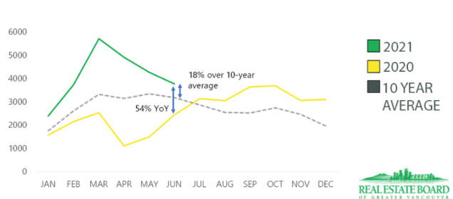
A timeline graph with 2 lines one with the historical average and one line with the actuals…with a dotted line with the historical average and the green line with the actuals…would that be possible? Thank you in advance.
When you say “historical data greater than the past two weeks”, how would you express that in a formula? Have you tried writing a query in Influx to experiment? If not, try that out.
Once you have the queries written in Influx, it will be very straightforward to plot both lines (queries) in the colors & patterns (solid or dashed) on the same graph and use the time selector.
I’m using flux query, so the visual setting is not available. So I am having troubles with getting multiple lines in the time series itself. I’m bit new to the Grafana platform, can this be done with the query itself or any other alternatives? Thanks a bunch in advance.
This topic was automatically closed after 365 days. New replies are no longer allowed.