Hi, I have encountered an issue I don’t understand and am looking for guidance.
First off, I’m running InfluxDB version 1.8.3 and Grafana 7.3.7, both in Docker containers.
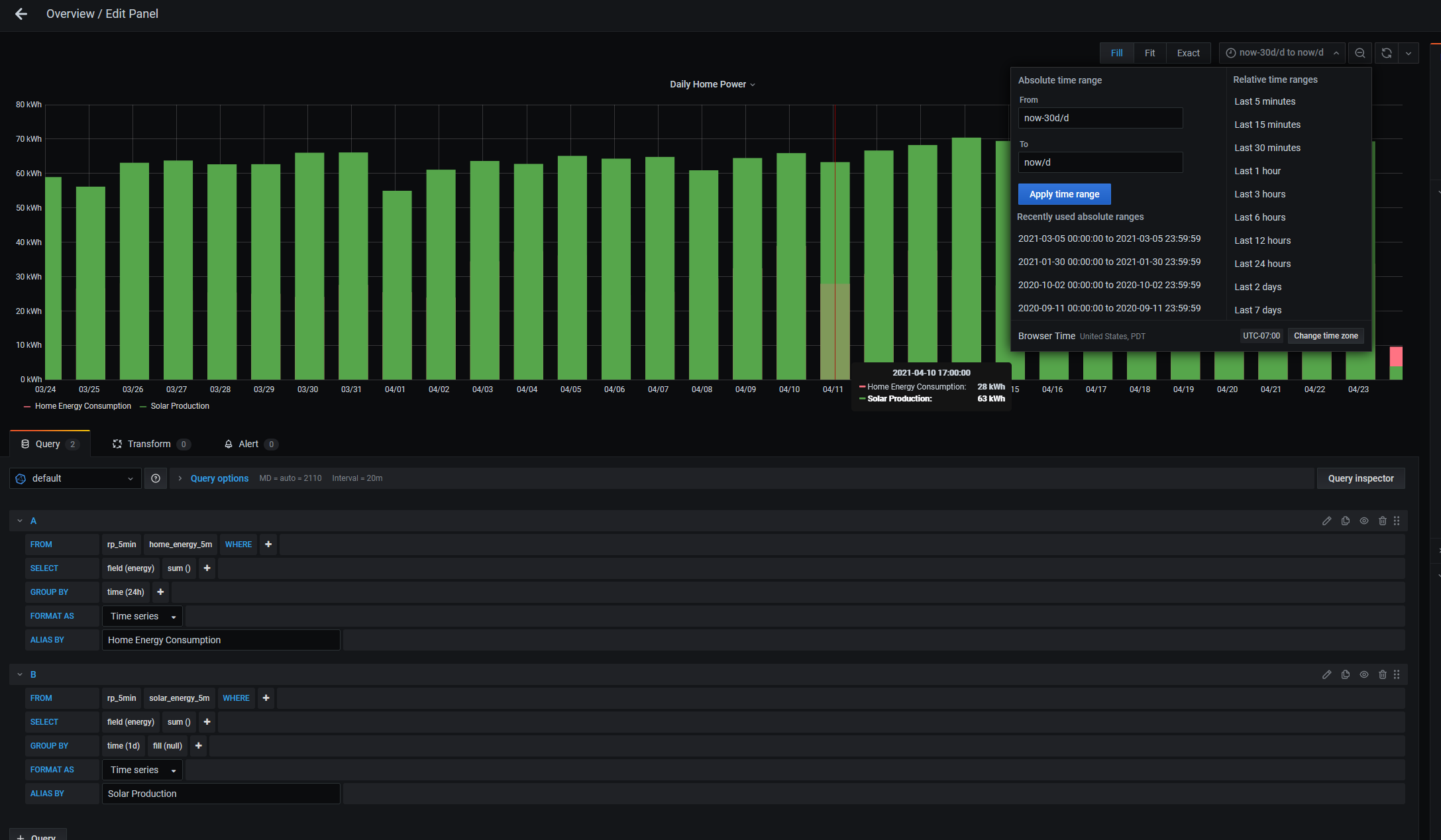
I’ve captured a screenshot of the issue showing as much of the setup as I can, including the issue, the time range, the queries, and the group by setting.
The problem is that the x-axis has dates that don’t match the date when I hover over the actual plot. As pictured, the x-axis label shows 04/11, but hovering over the plot shows 4/10 17:00:00.
Data is sourced from my own application and timestamps are sent to InfluxDB in UTC. The client accessing the dashboard is configured for the PST timezone as you can see in the time range selection box.
The dashboard is supposed to show figures from the database beginning at 00:00 and ending at 23:59 for each day. From my understanding the /d in the time range selection should accomplish this, and the group by 24h or group by 1d should both start at 00:00 and end at 00:00 the following day.
The sentiment here on related threads about timezones basically just seems to be “write your data in UTC timestamps and you’ll be fine”, so I’m not sure what’s going on.
Interestingly enough, I changed the timezone in the dashboard to UTC, and the x-axis dates now match when hovering. See below:

Here is what the latest data looks like from the shell:
> select * from rp_5min.home_energy_5m order by time desc limit 5;
name: home_energy_5m
time                energy
----                ------
1619243400000000000 0.07275790056125306
1619243100000000000 0.0720926660989204
Aside from all the annoying extra zeros on the timestamp, it does appear to be a UTC timestamp, and it’s within the last 10 minutes at the time of writing.
Thank you for your time and any feedback!


