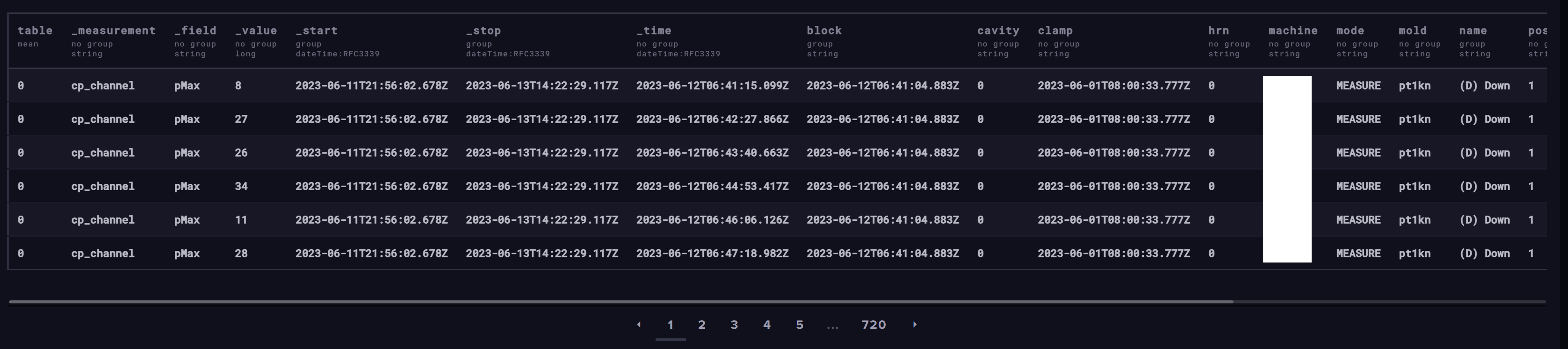
That helps, but can you do the same two queries in Influx Data Explorer showing the raw data?

For the first chart:

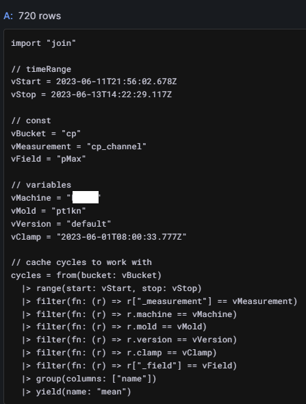
And for the second one:

Note that, more points are returned when group has only name tag.

Thank you for your time.

Segments are losts means, that I can not see the two blocks because all points are connected.
A possible solution I found :
- query with:
|> aggregateWindow(every: v.windowPeriod, fn: mean, createEmpty: true) - visualize with

- enjoy

But with the solution mentioned above, I still have limitations:
- using aggregateWindow, I am losing the original timestamp of the point, that I use in Data links and navigation.
To keep the original timestamp, I am updating the query like this:
  |> filter(fn: (r) => r["_field"] == vField)
  |> map(fn: (r) => ({ r with tOrigin: r._time}))
  |> group(columns: ["name"])
  |> aggregateWindow(every: v.windowPeriod, fn: mean, createEmpty: true)
  |> yield(name: "mean")
To make the Data links work, I would like to use the tOrigin tag as template variable but the tag not listed, so my Data links navigation does not working anymore.
So this is another dead end.
I am pretty stumped by this as well. I am almost certain is has to do with Grafana (not Influx) and wanting to join the different segments. The aggregateWindow solution is what I was also originally thinking to remedy the problem, but as you noted, that introduces some other problems.
I will keep thinking…
1 Like
I have never used the following overrides before:
- fields returned by query
- fields with names matching regex
Do you think any can help?
I am thinking about, can Grafana provide group-ing? In my flux query, I am going to provide map with aggreateWindow, but not groupping the series by name. Can Grafana provide group in Transformation to provide a visualization that I need?
Any idea? Should I open a feature request ticket?