Hi!
Running Grafana 8.5.1 and still using the old Graph panel somewhere. Now I would like to give the new Bar Chart panel a try and migrate one of those old panels to the new one.
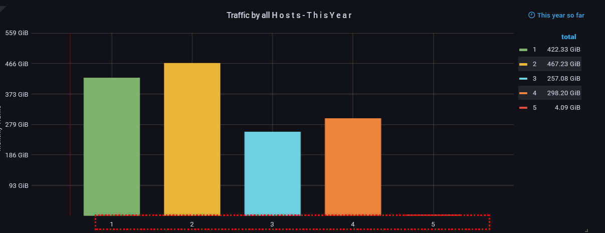
So far the old panel looked like, please see those labels which source is the alias $tag_month. The data is grouped by tag(month).
While the old graph panel gave me the opportunity to have some labels on the horizontal axis, the new bar panel chart does not, at least I did not find any option to do so. The migrated panel currently looks like below. The only label I can see is “00:00”.
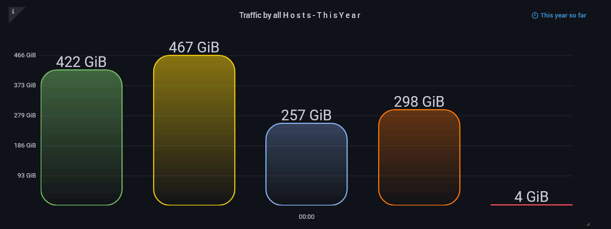
Anyway, I cannot force the beta graph panel to add labels like in the first picture. Can I assume that the bar chart is not capable of using such?
bar chart or bar gauge?
it looks like you might want to use the Bar Chart, which CAN use arbitrary strings on the x axis:
https://play.grafana.org/d/ktMs4D6Mk/5-bar-charts-and-pie-charts?orgId=1
See the docs for the data model that you will need to fit:
Thanks a lot for your reply and sorry for my late answer!
I’m already using this (beta) panel, but unfortunately, I do not get appropriate x-axis labels as in the sample dashboard.
(Sorry for not posting inline images, but I get permanent upload errors)
I’m posting my settings here and those from the Grafana website, combined in one image for a simple comparison. The main difference, on my side, is marked with a red circle. I’ve switched off/hidden the x-axis because, all I get as labels, is a single time value: 00:00
2022-06-03-152647.jpg
My panel source does contain many values, time dependent, and this may be the reason I’m not seeing appropriate labels.
2022-06-03-153006.jpg
I would like to have the same labels below each bar, as the legend shows on the right side of the above image.
My query is
SELECT sum("BYTES") FROM "basic" WHERE ("host" = 'ipfire' AND "interface" = 'green0' AND "dst_host" =~ /^$ipfire_host$/) AND $timeFilter GROUP BY "dst_host"