I suspect this is not an unusual requirement, but I can’t find an example. Apologies if the answer is obvious.
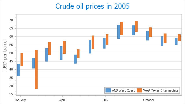
I want to plot daily min and max values for a number of sensors over a period of many days, e.g a month or a year. My thought was to plot it as range bar chart, similar to this example:

I’m open to other ways to display the data.
I’m using influxdb and querying for the data is straight forward:
SELECT min(“temperature”), max(“temperature”) FROM “environment” WHERE (“zone” = ‘inside’ OR “zone” = ‘outside’) AND $timeFilter GROUP BY time(1d), “zone” fill(null)
Thanks,
Evan