Pie Chart shows identitical colors for different labels

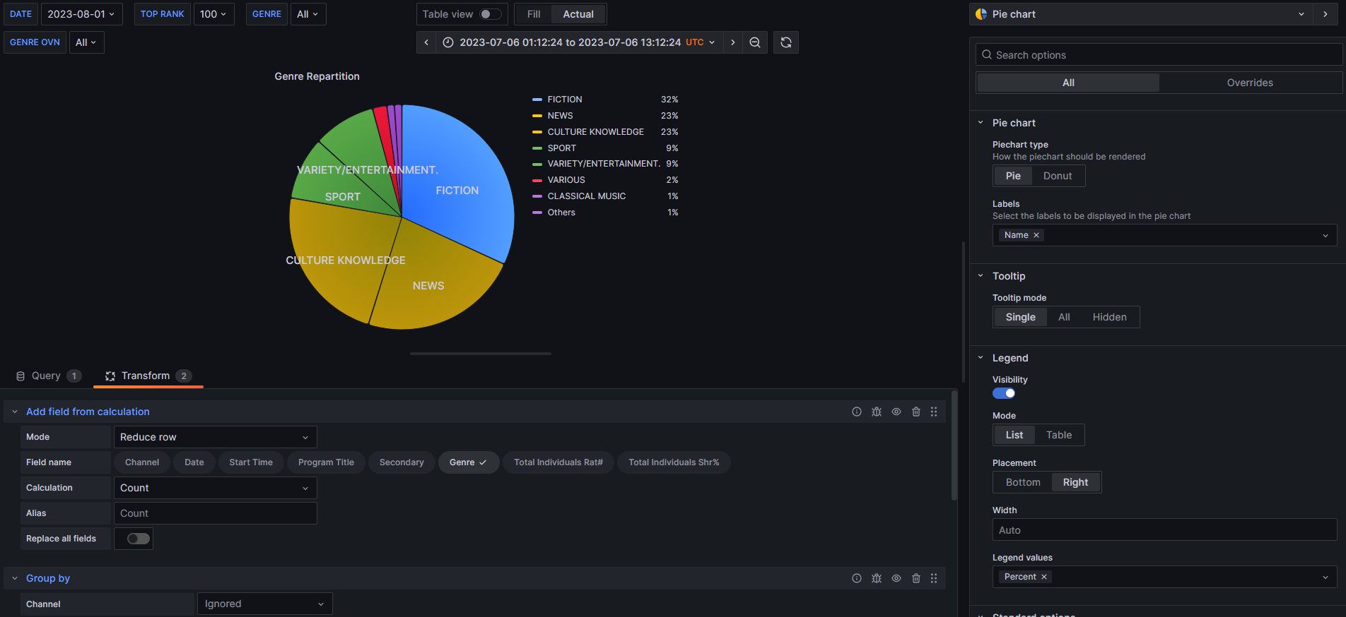
I’m trying to display a pie chart from a very simple 2 columns table, 1 with a Genre label, the other one with the count value for the Genre. This is obtained through calculation transformation and group by.

Here is the table:

However, the pie chart somehow decided to base it’s colors on the count values instead ot the labels values, resulting in identical colors for rows that have the same values. How can I change that ?

Does re-ordering your Transformations change anything? (i.e. first Group by and second Add field from calculation)

Well I found out I didn’t even need the calculation and could get the same results with groupby only by calculating an other field’s count, but with the same exact issue on the pie chart:

Bump… I’ve tried every kind of transformation and didn’t find what was wrong… Any idea ? Is it a bug ?

Hello there,

This might be related to how PieChart reads key/value differences. We will see whether it’s a bug and come back with information from the team responsible for visualisations.

Thank you for your patience!

Maybe try out apache echart grafana plugin, I am totally color blind so not sure if the colors came out different :laughing:

Hi there !

I’ve been updating Grafana package regularly and the same issue continues to occur. Is there any news on this topic ?

Thanks a lot !

Looks like it has not changed. Have you submitted a feature request in github for grafana for this?

I did not as the previous statements from @polinaboneva seemed to imply this was being looked up, so I assumed perhaps wrongly that the issue had been created.

1 Like

Here is a workaround I use with Elasticsearch Datasource. Hope It will work in your case as well:*

  • Add a second Group By field Date Histogram
  • Use this Value Options:
    ** Show: Calculated
    ** Calculation: Total
    ** Fields: Numeric Fileds