How to stack memory utilization graph without changing the total memory?

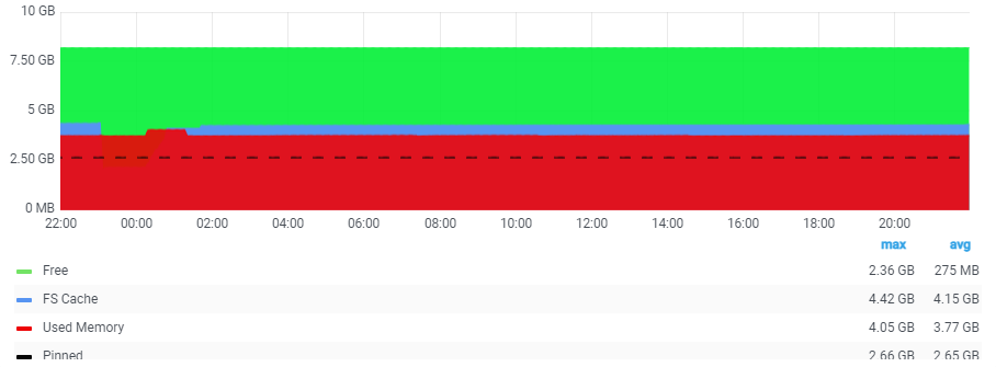
Below is the memory utilization graph from our performance monitoring tool

I am trying to draw a similar one in Granfa using data that is fetched from elastic, but I am not able to get the stacks like shown in the above picture

Below is the graph I am trying to create in Grafana

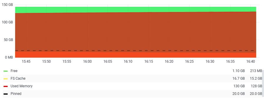
I am trying to get the “FS Cache” (Shown blue in the first picture) added to my graph as well, but it gets to the bottom of the graph, Stack option messes up the actual memory size. I need the FS Cache value displayed above the Used memory. How can I achieve that. Any idea?

I am using Grafana v7.4.5

welcome to the :grafana: forum, @sanandece

can you share some of your raw, unformatted data so we can try and mock this graph?

Right away I will also say: 7.4.5 is not an ancient version, but we are almost to 8.3.0, which has greatly expanded features. Highly recommend upgrading if you’re just starting out

Hi @mattabrams - Thank you for the response. Below is the raw data for the memory part from the json file

All the below value are to be divided by 256 to see in GB
the FS Cache in the Graph is memory.numperm in the Raw data
Used = memory.real_inuse - memory.numperm

“memory”: {
“virt_total”: 4194304,
“real_total”: 2097152,
“real_free”: 38226,
“real_pinned”: 678846,
“real_inuse”: 2058926,
“pgbad”: 0.000,
“pgexct”: 629.361,
“pgins”: 0.000,
“pgouts”: 6.350,
“pgspins”: 0.000,
“pgspouts”: 0.000,
“scans”: 0.000,
“cycles”: 0.000,
“pgsteals”: 0.000,
“numperm”: 1095811,
“pgsp_total”: 2097152,
“pgsp_free”: 2092984,
“pgsp_rsvd”: 8192,
“real_system”: 511522,
“real_user”: 1411132,
“real_process”: 451593,
“virt_active”: 828889,
“iome”: 8589934592,
“iomu”: 35741696,
“iohwm”: 71700480,
“pmem”: 8589934592,
“comprsd_total”: 0,
“comprsd_wseg_pgs”: 0,
“cpgins”: 0,
“cpgouts”: 0,
“true_size”: 0,
“expanded_memory”: 0,
“comprsd_wseg_size”: 0,
“target_cpool_size”: 0,
“max_cpool_size”: 0,
“min_ucpool_size”: 0,
“cpool_size”: 0,
“ucpool_size”: 0,
“cpool_inuse”: 0,
“ucpool_inuse”: 0,
“real_avail”: 1073593,
“bytes_coalesced”: 0,
“bytes_coalesced_mempool”: 0

1 Like

I think we are missing some values here. Please clarify how your two graphs relate to one another. What is the average? Max? how are these calculated?

And please included the raw, unformatted data as described in the link above, not a fragment of the JSON :+1:

@mattabrams - Sorry my graphs appear to have mixed up. I’ve pasted the correct ones below for your reference.

Both are memory graphs from same server. First graph is from a tool called LPAR2RRD, and the second one is Grafana using data injected into elastic using njmon.

I’ve pushed the json file and raw unformatted data here → (GitHub - sanandece/njmon_files)

image

Please take a look and let me know if it makes sense. Thank you

@mattabrams did you get a chance to look at this?

1 Like

@sanandece sorry for the delay here. Still working on this? If so I’ll try and mock this up this week :+1:

@mattabrams Thanks for getting back. Yes, I am still looking for help.

1 Like

@sanandece You’re right, stacked graphs stack the values on top of each other and the values can look misleading on the y-axis.

I created a sample graph with the sample data you provided. Let me know if this is what you’re looking for?

To recreate this in the Time series visualization, you’ll want to make these adjustments:

Change the Graph style to Lines and and adjust the Fill Opacity
(optional) Set the Gradient mode to Opacity if you want the gradient effect

1 Like