Colouring By Column Name

Hello all,

I am trying to colour my data by the column name they correspond to and I was wondering if that is possible with a time series graph? I have a line and bar graph in the same panel. The line is a success rate of the bars so the sections in the bar correspond to the line. So I want them to be the same colour so it is easier to see the corresponding bar and line pair.


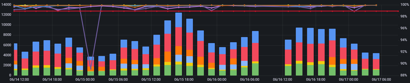
I’ve looked at the color scheme but that changes their colour based on the values in the rows of the query which are not the same given one result is a number and the other a percentage.
Are there any features I could use to regex the name and colour these appropriately?

will you always have the same values or do you need to achieve this dynamically? This sounds a bit like the Config from query results transformation, but that is for min and max values.

This is something that you could maybe hard-code, but I’m not sure you could create a scenario where you have query A, and the colors associated with the fields from Query A map to fields of the same name on Query B.

The names of the bars and lines are dynamic and can be in the graph or not. So I was hoping there was a way to by regex colour the lines and bars the same colour. I’m thinking that I am doomed to hard coding in everything.

1 Like